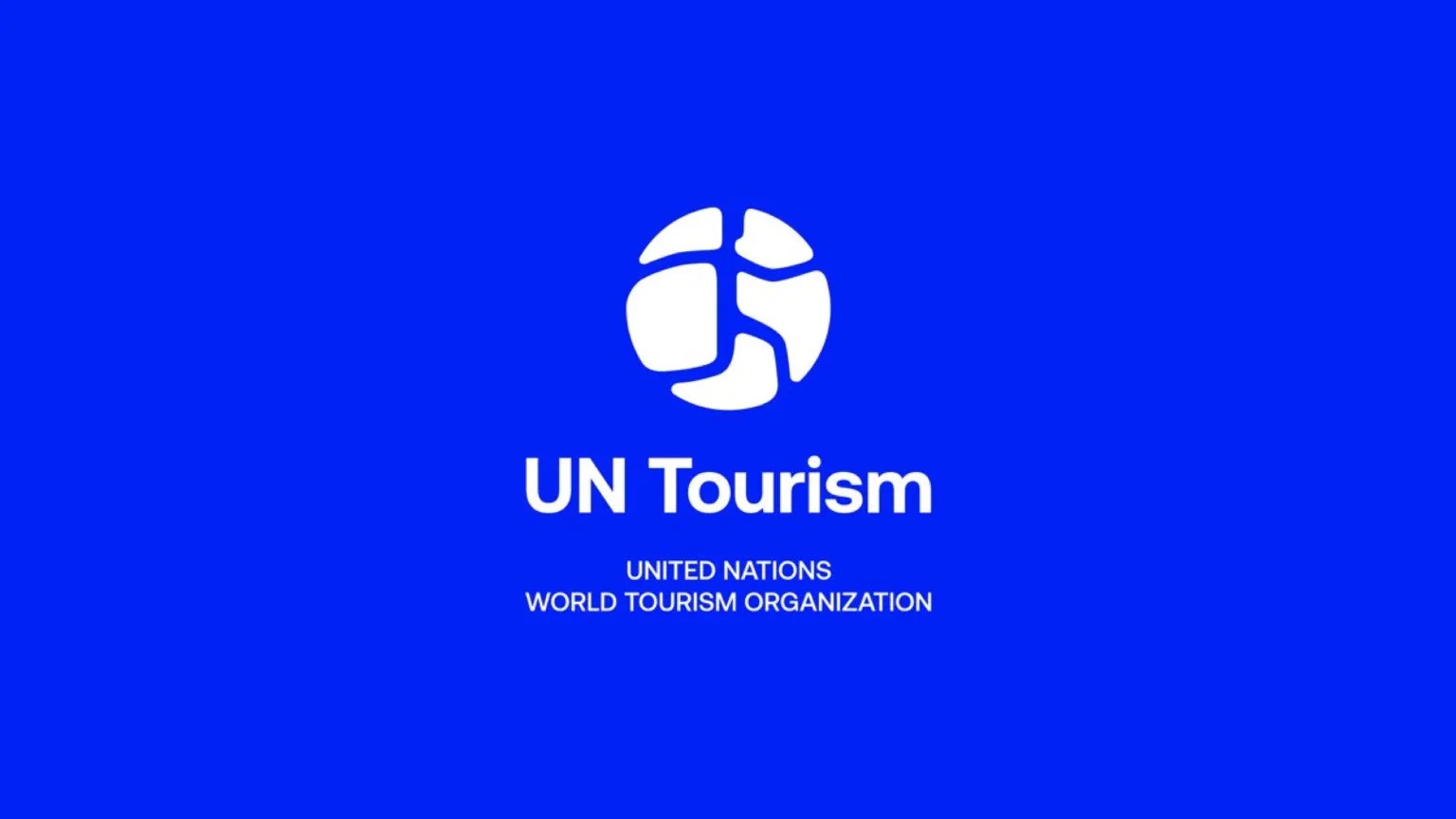
The World Tourism Organization, headquartered in Madrid, Spain, is a specialized agency of the United Nations. Its goal is to promote sustainable, responsible, and accessible tourism. UNWTO, as the organization is commonly known, serves as a global forum for tourism policy and brings together 170 countries. Recently, UNWTO underwent a rebranding and changed its name to UN Tourism, accompanied by a new visual identity.

Through this transformation, the global brand aims to solidify its position as a leader in tourism development worldwide. The visual aspect of the rebranding process was carried out by Interbrand, a consulting agency known for its works for KIA, Bugatti, and GE. The project, named “The thrill of a world to be discovered,” has been described as a significant step towards greater relevance.
The design team strategically redefined the model of UN Tourism, creating a fresh and cohesive visual language that fully showcases the agency’s potential. The new branding features simple elements that are both easily recognizable and memorable, clarifying the organization’s sphere of influence.

By abandoning its previous name, UN Tourism aims to be more understandable and relatable to people. Additionally, the decision to change the name was influenced by the potential confusion between the institution’s abbreviation and that of the World Trade Organization. The shorter name is expected to breathe new life into this global convention, supported by the new visual universe.
The UN Tourism logo depicts a blue human figure within a white circle, symbolizing tourism through its walking posture. This image draws inspiration from the Pangea symbol and transforms the map of Pangea into the map of the modern world, finally becoming the human figure in the animated version of the emblem.

The brand identity also incorporates lines as a key motif, which are based on the grid of geographical coordinates. These lines are intended to physically connect various brand touchpoints and digital elements such as websites, events, reports, and campaigns.
The color palette is another distinctive aspect of the UN Tourism rebranding, with Rich Blue chosen as the main brand color. This color gives the logo and other branded visuals a captivating appearance.

The UN Tourism wordmark is designed using a typeface from the Britanica font family, while a custom serif font was developed for the organization’s official texts and promotional materials. The intense blue color used for the typography adds to its impressive look.
The new UN Tourism brand will be gradually implemented in the coming months across all the organization’s representative offices, following the update of the official website and social media profiles.


