

Established in 1786, Demel, a pastry shop and chocolaterie, is a renowned gourmet and cultural attraction in Vienna, Austria. During the 19th century, this place gained immense popularity among the Austrian aristocracy, including Empress Elisabeth (known as Empress Sisi), earning it the prestigious title of Purveyor to the Imperial and Royal Court – Kaiserliche und Königliche Hofzuckerbäcker. In an effort to enhance its digital presence, Demel recently launched an online store and introduced new takeout packaging, prompting the company to revamp its visual identity.
![]()
Throughout its rich 200-year history, Demel has amassed numerous packaging designs and graphic applications, each representing different design trends. Following its acquisition by Do & Co in 2002, the brand’s logo featured an outlined wordmark in the Elzevir typeface, accompanied by the emblem of the Habsburg eagle.
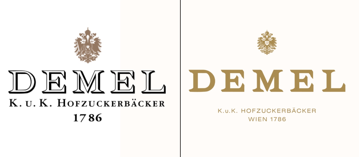
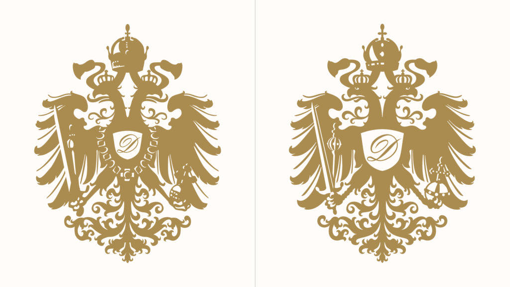
The new logo encompasses a fresh approach, with the Demel wordmark redesigned to create a subtle sense of dimensionality. The inscription “K.u.K. Hofzuckerbäcker Wien 1786” below the wordmark has transitioned from the Garamond font to Swiss 721 by Max Miedinger, a more modern typeface with enhanced width. Additionally, the eagle emblem has undergone improvements to enhance legibility and expressive qualities. Overall, the updated emblem, with its restructured negative space, exudes a more luxurious and contemporary aesthetic.
Centered around the new emblem, the visual identity showcases a color palette that includes a deeper shade of gold compared to the previous one, as well as several neutral tones to provide greater flexibility, particularly in digital applications. Furthermore, a simplified version of the eagle emblem has been developed to ensure legibility at smaller sizes, accommodating packaging requirements and profile images on social media.
Regarding typography, Demel has adopted Neue World, a font developed by Pangram Pangram, which adds an elegant and playful touch to the brand’s texts. This choice is pivotal in bringing the brand into the digital world. A digital image of Federico von Berzeviczy-Pallavicini, an iconic owner and manager of Demel in the 20th century, supports this ambition. The visual elements are enriched with decorative frames inspired by the molding found in the Demel store, providing a contrasting effect.

Photographs also play a significant role in Demel’s new look, as they effectively convey the exclusive quality of the pastries and delicacies. And visually, the result met the expectations so that Katharina Gilbert, who was responsible for the redesign, proudly stated that the photographs didn’t virtually need to be edited. Ultimately, all these elements honor traditional aesthetic codes while preserving and highlighting the iconic image of Demel’s pastry and confections.


