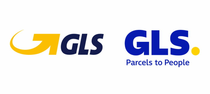
Owned by Royal Mail, General Logistic Systems, one of the largest parcel networks in Europe, has adopted a new brand identity. According to the company, the rebranding is occurring when GSL is undergoing big changes, aiming to strengthen its leading role in international transportation and increase its presence in the B2B and B2C sectors.

GSL Group was founded as German Parcel in 1989, basing on a German freight forwarding association. Now, the Amsterdam-headquartered company offers logistic services in 40 countries. Last year, it delivered more than 840 million parcels across the world.
GLS’ modernized branding is intended to convey the company’s success and supporting the growth goal as a service provider, as a GLS statement says. A new logo and corporate colors were adapted to be consistent for the first time in 20 years.
 .
.While the company has used a logo with a yellow arrow and a black wordmark since its inception, the new emblem inherits the old motif in a way, featuring a GLS wordmark with a “G” formed like an arrow as well as a yellow dot which symbolizes “the priority of the company: its customers in the digital era, while GLS is staying next to them”. The ultramarine shade was chosen as a corporate color; the primary logo includes the “GSL” in deep blue, and an inverted version will also be in use.


