

Today, many brands have to express their identities through an increasing number of communication channels, including print, audio-visual, and digital media, with a soft and distinctive approach. In the conditions where expectations for brand strategy are higher, a redesign can be a really serious task. This can be seen in the case of Landor and the fresh brand of the design agency, which was previously known as Landor & Fitch.
![]()
Established in 1941 by the famous designer Walter Landor, the agency is now a landmark in the world of branding. An iconic thing for the agency itself has been the Klamath, Landor’s ship, which had been docked in the San Francisco port for a long time, serving as a headquarters for the company. That eccentric office (a choice that reflected the owner’s personality) had enough inner space to accommodate four design rooms, a focus group researching zone, a photo studio, and a slide library. It was there that Landor generated the iconic identities of Levi’s, Marlboro, British Airways, FedEx, and other brands.

More than 80 years after its inception, Landor is undergoing a reorganization to adapt to new conditions on the market, strengthening its partnership with the sound design studio AMP, the architectural company BGD, and ManusMachine, which is involved in animation design. Context-oriented adaptiveness is a key point of Landor’s strategy, with plans to increasingly invest in technological innovations, especially artificial intelligence, in the coming years.
When it comes to the redesign, the agency’s image is expressed by a sleek wordmark highlighting its founder’s name. The glyphs with widening serifs refer to those font families that were based on stone inscriptions. A certain refinement is achieved through the contrast between thin and thick lines, while the absence of serifs at some ends of the letters tells us that it is still a custom typographic design with modern taste. Showcasing a strict and, at the same time, somewhat playful style, it can be considered a cliche-breaking solution among a huge number of serif and sans-serif typefaces. This asymmetric sleekness is quite impressive, conveying all the vigor the company has accumulated over the years.
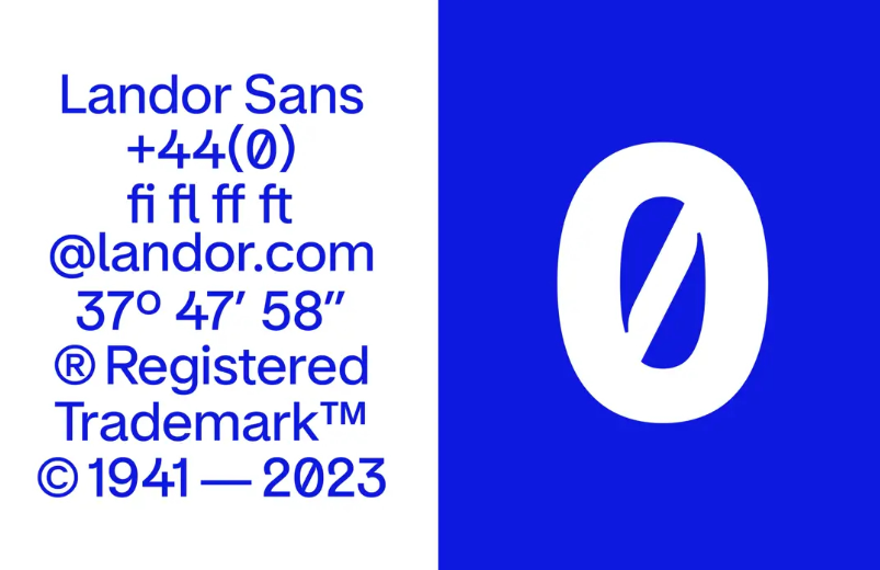
Over decades, the brand has used yellow and black as its corporate colors. Changing its visual identity, Landor replaces them with deep ultramarine. This blue shade features heavily in the static and animated visuals first presented by the company. The fact that the agency significantly relies on moving images in the building of its new brand look is quite amazing.

Supporting the general identity style, the brand’s additional iconography is made of 3D-rendered motion design with abstract patterns that resemble the movement of water. With this, the new typography is represented by Landor Sans, a Grotesk-family typeface, developed by a foundry in Milan.


