FIFA has recently presented a logo and a slogan for the next Women’s World Cup that will take place in Australia and New Zealand in 2023. According to the football association, the logo and the whole brand identity symbolize not only the fact that the world’s best teams will be brought together in one place but also the spirit and values of the two host countries.

In June 2020, FIFA announced that Australia and New Zealand would share the 2023 Women’s World Cup. The event will be the first women’s world football championship that will be held in the southern hemisphere. The number of the participating national teams, as well as the prize fund, has been doubled, so 32 teams will compete for the trophy at the final stage for the first time. Now, the competition has received a logo as well as a slogan – “Beyond Greatness”.
As a FIFA press release says, the brand identity for the 2023 Women’s World Cup includes a new exciting and bold visual approach that has to unite and inspire people across the world through the power of the women’s football championship.

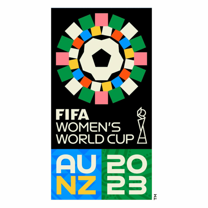
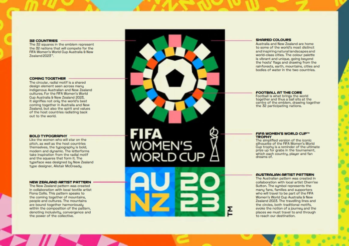
The emblem’s design reflects the landscapes and bright natural colors of the two host countries while creating the palette based on their tropical forests, mountains, lands, waters, and cities. The logo features a radial motif with 32 colorful squares that symbolizes the competition’s expansion to 32 teams and represents a frequent element of the folk art of the indigenous peoples in Australia and New Zealand.
Indeed, the design approach in the presented logo is something new. FIFA refused the idea of placing the trophy in the center of the emblem — the association has committed this concept since 2013. Instead, the trophy is depicted in a modest manner, drawn with thin lines as a decorative element.

The design can be seen as a hint that the 2023 FIFA Women’s World Cup as a brand will be organized more independently. The future world championships, including men’s competitions, can also be expected to receive logos that will significantly differ from each other because the latest World Cups showed that the design concept focusing on the trophy is completely exhausted.


