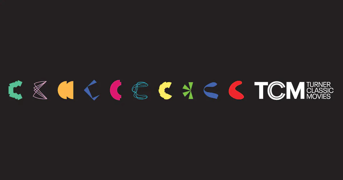
Turner Classic Media, owned by WarnerMedia, has refreshed its brand identity for the first time in seven years. The rebranding was carried out in cooperation with the New York-based design agency Sibling Rivalry.
TCM’s updated look comes with the new slogan “Where Then Meets Now” expressing the idea of the 20 century movie storytelling for the present. According to the network’s general manager Paula Changnon, the new TCM identity better conveys the respected image the company earned through the years. It reflects the network’s new energy to continue presenting the beloved classic movies for its audience.

The overhauled visual identity is distinguished with a technicolor gamma paying tribute to the classic film coloring technology first introduced more than a hundred years ago. The logo of the network was redesigned in a new typeface. In the static representation, it is accompanied by a number of “C”’s in different forms and colors. For the screen version, the emblem will feature an animated “C” which will split first into a double “C” meaning the present day’s view of classic movies, and then into four “C”’s standing for TCM’s principles: culture, context, curation and connection.
The TV brand has also presented a sound signature created by Made Music Studio. It represents a mixture of several genres, honoring the iconic Hollywood musicals. The new visual and sound design will be applied to the TCM on-air sets as well.


