

Crystal brand Swarovski has carried out a rebranding that includes a updated version of its swan logo and a new interior design for its 28 stores across the globe. According to Swarovski’s representatives, the new design is based on the company’s traditions of “innovation and reinvention” and is intended to correspond with the requirements of the modern world.
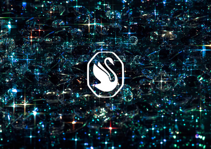
First of all, the fresh design’s leitmotif can be seen in the updated Swarovski logo. The iconic swan in the new iteration is facing to the right, featuring a more elongated neck and two wings, more clearly drawn compared to the old one-wing version. The brand chose the swan as its emblem in 1988 as a symbol of everlasting love and nature’s beauty, the notions that have always been associated with Swarovski’s crystal glass and jewelry.
For the logo, the swan has been placed into an octagonal frame that symbolizes a faceted crystal as well as the idea of rejuvenation. This “candylike octagon wrapping”, as the brand says, is also replicated in the refurbishment of the Swarovski new stores, the first of which are planned to open in Milan, Paris and New York.
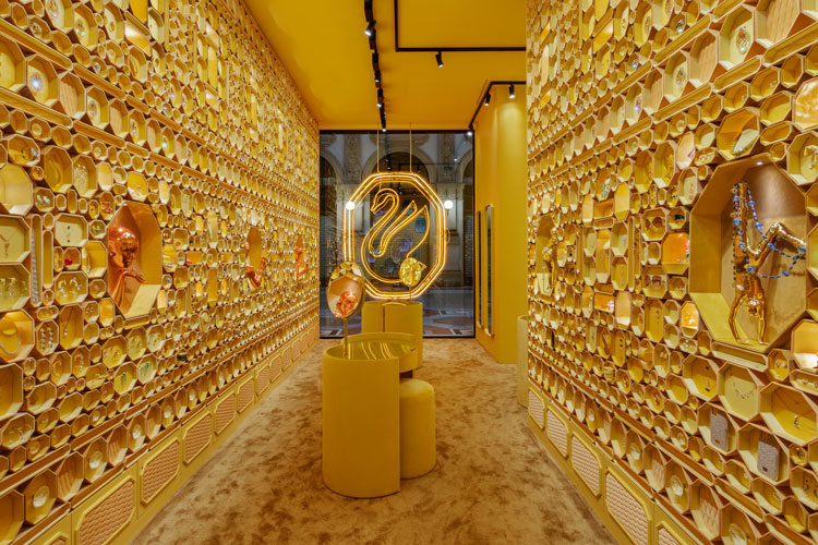
These elegant “sensorial retail spaces” designed in gold will offer to browse and to buy Swarovski luxury pieces including jewelry, glass sculptures, rhinestones, chandeliers and watches. All of them will be exhibited against the background of the octagonal swan logo.
Such a design conveys Swarovski’s idea to create a place that could give customers a kind of experience of magic and wonder, imbuing them with joy, energy and optimism.


