

Last year, technology company Match Group replenished its dating app family, which includes Tinder, Meetic, Hinge, and Match.com, with another service of this kind named Stir. This dating app is mainly oriented towards single parents who may specify, among other things, when they have spare time, considering the schedule of their children. In other words, Stir was created for people who believe that children will not interfere with relationships. Trying to change stereotypes in society about single parents, the company has recently launched a campaign under the motto “Break Every Single Rule”, which also demonstrates Stir’s new visual identity.
![]()
Stir’s campaign, according to a press release, will include posters featuring real single parents. Such storytelling with playful slogans is going to encourage other single people with kids to find a match. The campaign emerges alongside the online service’s fresh branding, created by the New York-based studio The Working Assembly, which includes a new app design as well as a new logo distinguished by flexible and fluid graphics.
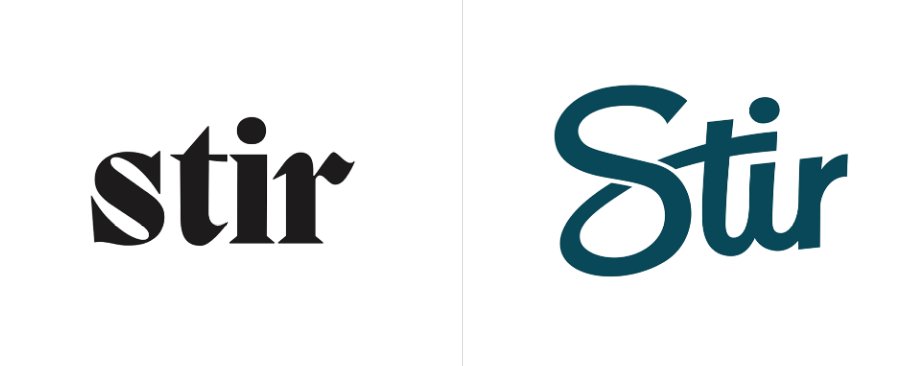
Although the original Stir logo was executed in a rather kinky style, characterized by sharp angles and curved lines, its strict design was obviously insufficient for a dating service with a mission to make people’s lives brighter. In contrast, the new emblem shows off something more cheerful that tells about the family-friendly orientation of Stir. Considering the fact that the app has, so far, received middling reviews, this more elevated identity will hopefully help it unwind among the target audience.
When it comes to the design itself, the logo’s main, eye-catching feature is the loop of the “S”, which is also used as the crossbar of the “t” and separates the “i” from its dot. It can even be viewed as a symbol of relationship, binding the letters into a single object.
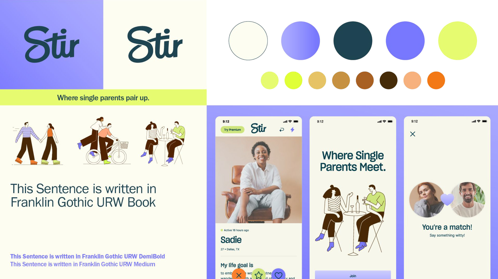
The color palette of the Stir brand is dominated by light purple contrasting with Sherpa Blue of the base version of the logo. The branded colors can also be found in the illustrations, which play up, in a naive style, the theme of dating.
In general, Stir’s new identity, like the brand’s campaign, is intended to convey the feeling of confidence and safety one can find in dating helped by the service. It says that single parents can venture into new relationships to create a happy family.


