

Launched in 2008, Sirius XM is the US’s largest satellite and online radio company, with an audience of more than 34 million subscribers. Headquartered in Manhattan, New York City, the broadcaster positions itself as an “audio entertainment provider”, offering a wide range of services, including the Sirius XM subscription, the streaming music service Pandora, and a large podcasting network. The radio company enjoys its popularity thanks to such programs as the Howard Stern Show, the Team Coco radio plays, and its great hosts, like Andy Cohen and Kevin Hart.
![]()
Recently, Sirius XM presented its new visual identity, announcing its branded new-gen streaming app that will gather all the products of the broadcaster. The branding was developed by the New York-based design studio Uncommon.
Sirius XM’s previous logo, which had been used for 12 years, left much to be desired. Those radio waves embracing a wordmark with a disproportionately big lowercase “m” made up a rather mediocre design. Plus, the combination of dusky shades of blue could unlikely add at least some expressiveness to that emblem.
![]()
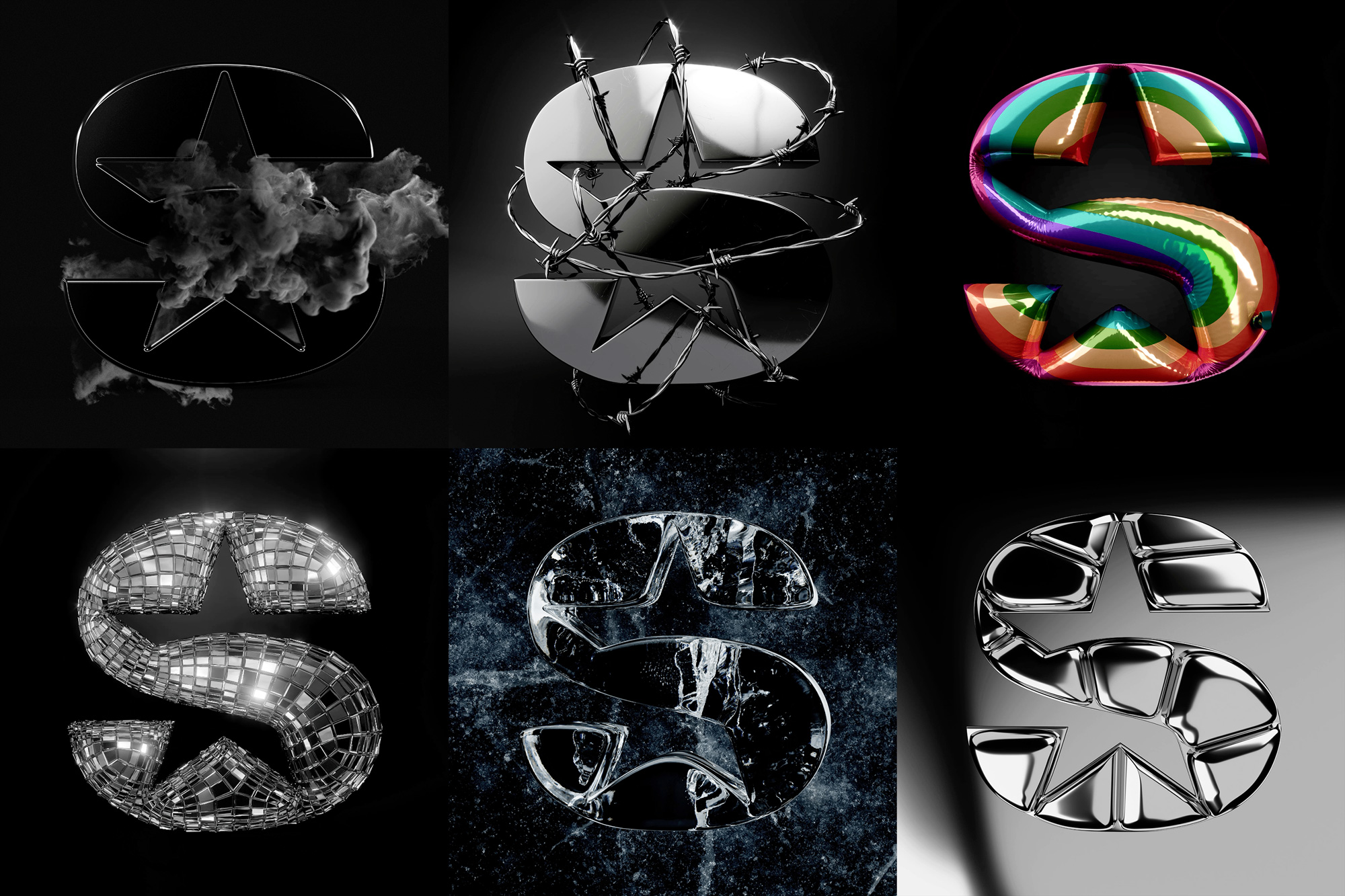
The new logo, however, brings a breath of fresh air to the brand’s old typography with a brighter blue color, the “XM” redesigned in uppercase, and first of all, star-shaped cut-outs in the initial “S”. Conceptually, this approach reminds us of old-fashioned Hollywood glamour, where the basic idea is to introduce all the stars present, and that’s an outstanding move. In addition, this refers to Sirius as the brightest star in the night sky, which justifies the element as a distinctive feature of the logo.
The rebranding of Sirius XM is more than just an update of the logo and brand colors. This refreshment demonstrates the company’s commitment to remain at the forefront of the audio and video industry. Amid the growing competition in the audio streaming sector, Sirius XM has to reinvent itself to meet the changing expectations of its audience.

Another interesting point about the new Sirius XM identity is the return of Stella the puppy, which featured in the broadcaster’s logos back in the 2000s. Although she is not on the emblem again, Stella appears on separate branded illustrations as a revived mascot of the company. The character was slightly redrawn, keeping, however, its somewhat abstract outline, which has been making it so attractive.

The redesign was surely a rather complicated task, come to think of it. Indeed, the design team had to save the same weight of the “S” and, at the same time, reduce its area to add the star forms. By fitting precisely together the star’s ends and the edges of the “S”, the design testifies to a great concept, while the fact that the central curve in the letter is left untouched tells us how much the project was thought out. In addition, the “S” can effectively work as a stand-alone symbol, showing off the star more clearly.
Unveiling its new visual identity, Sirius XM has launched a promo campaign featuring radio and pop stars like Ashley Flowers, Kelly Clarkson, and Kane Brown. Additionally supported by a Sirius XM fashion clothing line, the refreshed brand opens up new opportunities. Nevertheless, the company still has a long road ahead to equally compete with such giants as Apple Music and Spotify.


