Originally founded in 1973, Sanofi is a French multinational pharmaceutical corporation, one of the world’s largest drug manufacturers. Throughout its history, the company has experienced a number of transformations, the latest of which was in 2009, when Sanofi merged with Aventis. Despite its failure to create a competitive COVID-19 vaccine, the company is determined to develop the business, confirming this with its new visual identity.

Unveiling a new logo, the corporation is aiming to unite “many cultures, identities and brands” under a single trademark. Making this step, Sanofi has great plans for the future, as a press release says.
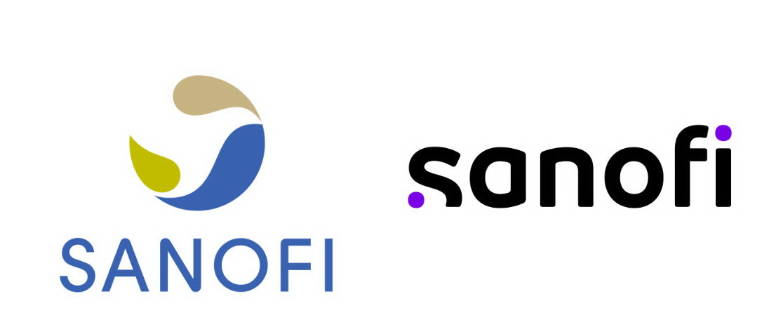
Sanofi’s previous logo was introduced in 2011. This round emblem that was called The Bird of Hope gives way to a lowercase wordmark. The corporate colors were changed as well – instead of a green-and-blue palette, the company will use purple as the only brand color.

As for the new logo, it was inspired by “simple and moving-oriented codes of the technological industry”, according to Sanofi’s statement. The wordmark features distinct letterforms as well as two purple dots which symbolize, as the company says, a scientific journey between a start point – curiosity and asking “what if?” – and a final point – a moment of insight, when innovative solutions appear to influence people’s life.
The rebranding was carried out in cooperation with the design studio FutureBrand from Paris. Sanofi also published the Our New Identity video.


