

Founded in 1942, Bombardier is a Canadian business jet manufacturer. While commercial aircraft are currently the main products of the firm, represented by the Global and Challenger model lines, the company was also involved in the manufacturing of rail equipment and recreational products like snowmobiles and watercraft. As part of a business transformation, Bombardier recently adopted a new logo to visually highlight its aircraft direction and contribution to global aviation.
![]()
In the 2010s, Bombardier experienced some financial problems which forced the company to sell some of its regional divisions, and in late 2020, the manufacturer also sold its rail subsidiary. Since then, Bombardier transitioned solely to business jet manufacturing.
Presenting its new logo created by the New York-based design studio Lippincott, the company called it a “symbol of progress”. The icon named the Mach is intended to convey Bombardier’s strong heritage and innovative spirit. The figure, as the studio describes it, is a silhouette of an aircraft breaking the sound barrier, emphasizing the manufacturer’s current focus on commercial aviation. In this design, the striped structure symbolizes an aircraft and is also a reference to the Learjet brand with its red-striped plane tail logo, which was a part of the Bombardier group.
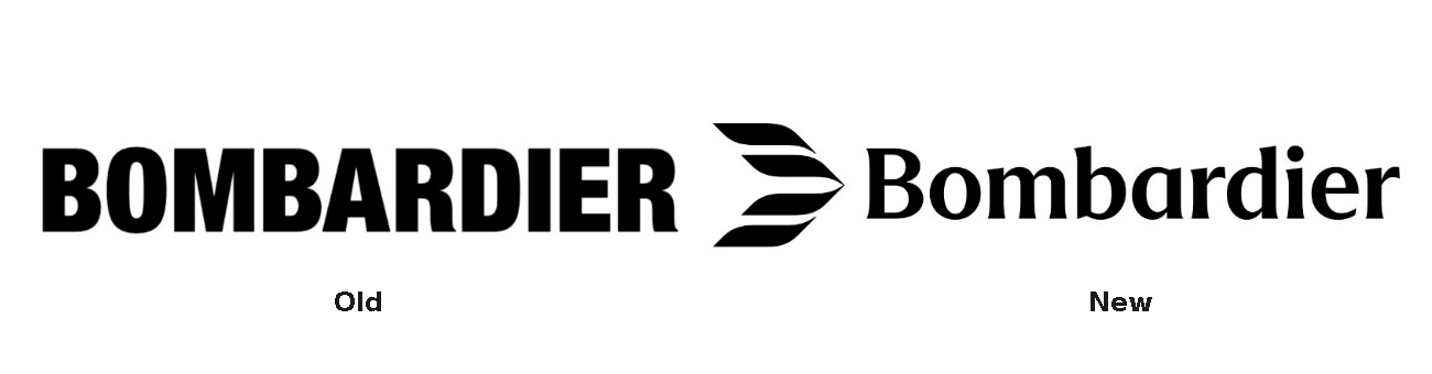
The logo also includes the wordmark “Bombardier” designed in a custom typeface that, according to the company, showcases a contemporary and sophisticated look. The font is distinguished by subtle serifs which echo the graphic style of the Mach, highlighting the brand’s “passion for precision”.
Furthermore, the Mach is used in the design of Bombardier’s branded livery. A pattern made of the reproduced symbol will be applied to the fuselage and vertical stabilizer, creating an immersive feeling.

Along with the logo’s Anthracite Black as the main brand color, the color palette also includes white and sand hues. The mild pastel tones will be used for the trim of the manufacturer’s aircraft.
It should be mentioned that this is the first rebranding of Bombardier in 20 years. Previously, the manufacturer used a pure all-caps wordmark. So the Mach, which is apparently inspired by the Mach number, a significant quantity in aerodynamics, is the brightest innovation of this rebranding.

This overhaul demonstrates exclusivity and excellence and conveys clearly the essence of the reformed company with its rich tradition of aircraft engineering. Although the previous Bombardier wordmark in Neue Helvetica Condensed became rather recognizable within the industry, the Mach is definitely a step forward as a laconic signature of the brand. Here, we can draw an analogy with the sprocket logo the company had been using for more than 60 years. With some changes over time, it perfectly reflected Bombardier’s multiple technical directions.


