

In 2017, Reddit launched its mobile app, bringing a new brand positioning. Now, five years later, the company believes its users and the Internet at large have advanced considerably, so it’s time for the platform itself to do the same. And this is expressed in the new image of Snoo, the brand’s mascot, that has received a 3D design.
![]()
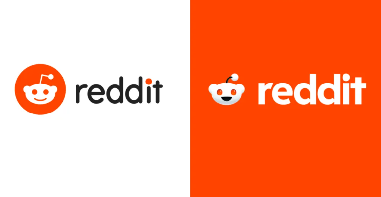
The visual changes are intended to highlight the brand’s main distinctive feature: talks and discussions that take place on the platform. While emphasizing this aspect in a rather modern way, the new Reddit brand identity, according to the company, will hopefully be more consistent and recognizable for the general public. The Reddit redesign was entrusted to Pentagram, which created a full brand visual set including new typography, colors, icons, and a 3D logo.
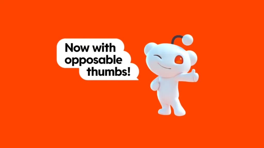
A real highlight of the rebranding is the transformation of Snoo, which has always been an integral part of the Reddit logo. The character will be more dimensional and animated now, with more postures, facial expressions, and emotional reactions. In some visuals, Snoo is designed, showing a thumb up for the first time in Reddit’s history.
As Pentagram explains, the design team “saw an opportunity to make Snoo into an iconic character, like, for example, Super Mario, and reinforce his role as Reddit’s mascot by formalizing his general form and details”. For this purpose, they first created a flat Snoo icon and rendered it into a 3D image with the same detail processing that is usually implemented in the creation of Pixar characters.
The new logo also lays the foundation for a new style of illustrations, transitioning from isolated images with no common thread to 3D icons united by a common concept.
Besides, Reddit adds two custom typefaces: Reddit Display and Reddit Sans. The former is basically used for the logo’s wordmark, while the latter is intended directly for use on the web.
Apart from the logo’s design, Reddit Display is featured in the speech bubbles in the illustrations with Snoo. It is perfectly suited for bold and expressive headlines.
As for Reddit Sans, it was developed keeping in mind the digital environment. It is an adaptable font designed to be quickly identified, providing a more accessible user experience. As planned by Pentagram, Reddt Sans will be an open-source typeface, available on Google Fonts and GitHub.

The new Reddit branding also includes a wider color palette. While orange-red stays the brand’s main color, it will be complemented with other hues, like Guava Pink, Lime Green, Juniper Blue, and Banana Yellow. Such a combination can provide a really varied visual identity.
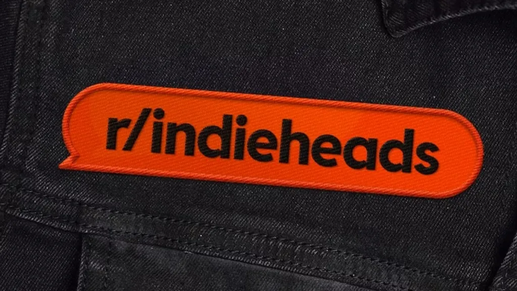
Another new identity element of Reddit is a speech bubble. According to Pentagram, using speech bubbles in different colors will emphasize the great variety of communities, thoughts, and talks on the platform.
The updated image brings fresh air into the platform through its redesigned mascot, which makes the rest of the visual identity equally expressive, while the color gamma and other elements help Reddit create an integrally digital brand.
Additionally, there are rumors that Reddit is going to enter the stock market. So this rebranding may be seen as a preparatory step for a possible IPO.


