

The Italian cruise line Costa Crociere, a leading company of the travel market through its brands Costa Cruises and AIDA Cruises, has adopted a new logo. With the altered visual identity, the company is willing to tell about the changes it has experienced over the last few months.
According to Costa Crociere, it has updated all its offerings, emphasizing the “steadfast exploration of the travel directions”. The innovations are so important that it deals with a totally new way of traveling. In the future, Costa will focus on three key activities: tours, cuisine, sustainability. The concept is consistent with the principles of the travel industry’s declaration of value-oriented, stable and comprehensive tourism. All of this is reflected in the company’s new branding.
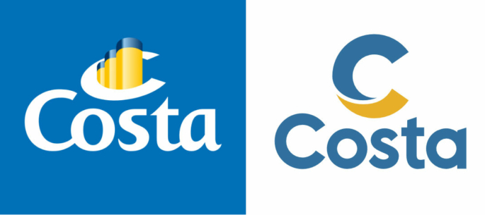
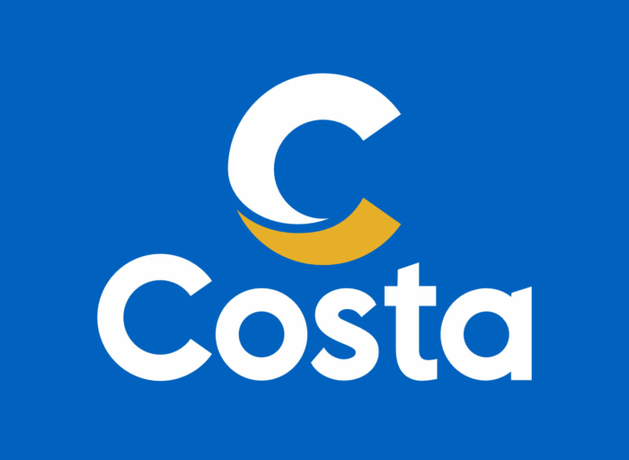
Costa’s ships have been marked with a “C” on their funnels for more than 70 years, and the latest time when the cruise line changed its logo was over 20 years ago. Now, the travel brand’s “C” in two colors has dropped the three funnels and the perspective distortion which were in the previous version. The company says the “C”, divided into two segments, includes the elements symbolizing the earth (yellow) and water (blue), bringing them together and forming “a curved, embracing hugs”. The wordmark has also been redesigned, switching from an italic font to a straight sans-serif typeface.
The fact that Costa ditched the funnels is quite understandable. It means exactly that value of sustainability that was mentioned in the company’s press release, reminding us of the ongoing discussions on how the tourism industry influences climate change. Anyway, funnels are not the elements to embellish a company in 2021.
The new logo’s geometrical austerity – of both trademark and wordmark – is pointedly clear. The two-segment “C”, looking dimensional, conveys some charm and good spirit. It is laconically designed for maximal flexibility that will stay consistent even in 20 years.


