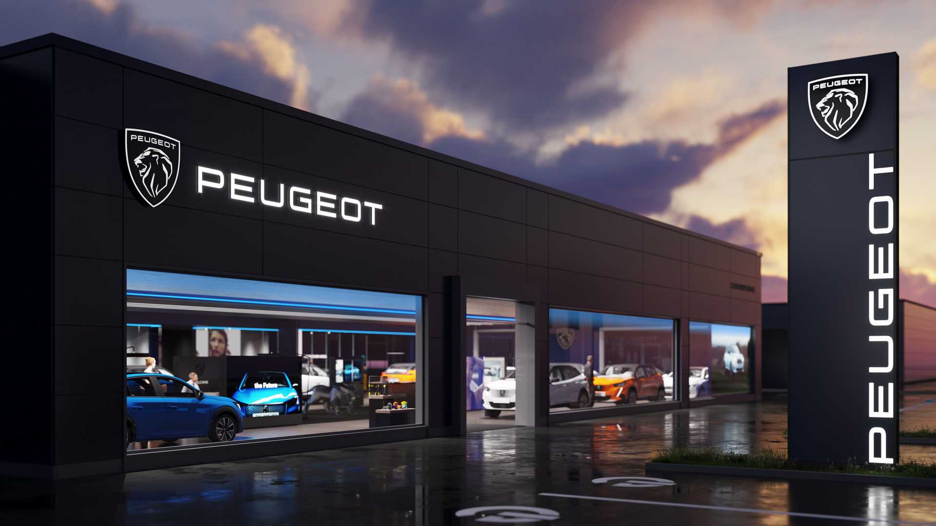
On February 25th, Peugeot unveiled a new version of its iconic lion logo. Since its inception, the French car maker changed its emblem for 10 times, and this is the 11th iteration of Peugeot’s symbol.

While the logo was announced ten month ago, and its details have been kept a secret during this time, it will mark the hood of the Peugeot 308 that is going to be presented in March. According to the company, the emblem was influenced by the logo of the 404, which was produced in the early 1960s, and especially by that one noticed on the e-Legend concept the manufacturer presented at the 2018 Paris Auto Show.

Peugeot has saved the overall design of the lion, but it has abandoned the detailed forms, giving the emblem some dynamic lines. Formed as a shield and carried out in black and white, the logo features a lion’s head, sideways, with an elegant mane. It also includes the all-caps wordmark “Peugeot” in a more modern style, compared to the 1960 version. As we can see, the company chose not to follow the flat design maintained by many automakers, lately.
The new emblem’s neo-retro style witnesses the brand’s desire to bring some nostalgic memories to its fans. With a laconic, vintage and fine design, it has to symbolize Peugeot’s aspiration for big marketing that was recently demonstrated, in a successful way, by the Car of the Year awards for the Peugeot 3008 in 2017 and the Peugeot 208 in 2020.


