

Established in 1843, Glenmorangie is a whiskey brand known for single malt whiskey available in 18- and 25-year-old bottlings, cask finishes, and a range of special edition bottlings. Ahead of its 180th anniversary, the company, headquartered in Tain, Scotland, has rolled out a new visual identity, alongside reworked packaging designed in a refiner manner.
![]()
Having a long history, the Glenmorangie distillery is a subsidiary of the French group Moet Hennessy Louis Vuitton since 2004. In recent years, the company has increased its appeal in the overseas luxury goods market, offering new brand whiskies like Nectar d’Or, The Quinta Ruban, and LaSanta.
As for the redesign, the brand’s look was comprehensively revised. Apart from the general visual elements, it affected the packaging for Glenmorangie’s major products including the forms of bottles and labels.
![]()
According to the distillery’s Global Head of Brand Louise Dennett, the remastered packaging conveys the taste of the Glenmorangie whiskey, reflecting the creativity the company brings into its single malt beverage. Glenmorangie has to stand out from other brands through bright colors, expressive typography, and enhanced branding in general.
Glenmorangie’s brand-new bottles are distinguished by a curved outline with wider shoulders and conic necks which widens towards the top. The greater curvature is the feature that is intended to give the brand a distinct face, positioning it stronger in the premium segment.
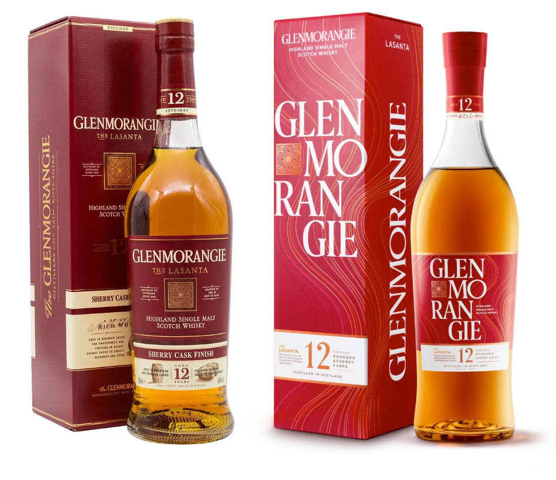
The new typeface is used on the labels and the front side of the packaging, while the brand’s name is executed in four lines for the first time. Also, Glenmorangie retains its branded orange color deriving from the flavors of oranges, honey, and peaches that are being used for this Scotch whiskey.
The new branding is currently implemented under the campaign “It’s Kind of Delicious and Wonderful” that is led by DDB Paris.


