

Established in 1982 to create a cultural alternative to BBC and ITV, Channel 4 is seeking to integrate into the changing landscape of telecasting. Moving to more modern technology including digital coverage on different platforms, the broadcaster is also reshaping its visual identity. For a new look, the channel’s in-house design studio 4creative has been cooperating with designers from Pentagram.
![]()
According to Luke Powell, Pentagram’s creative director, Channel 4 had conducted research, defining what and why should be changed in its image to visually correspond with technological innovations, before it applied to the studio. One of the most important things for the broadcaster was to improve the recognizability of the Channel 4 content no matter on what platform people are watching it.
Another priority of the channel for the rebranding was to “maintain the creative spirit inherent to Channel 4”. As 4creative’s head Lynsey Atkin explains, the agitational role of Channel 4 within British TV is widely known. And this position still remains this way as many believe this is the main quality of 4. So the designers tried to find a balance between the broadcaster’s traditional image and a new brand system so that people could easily navigate the proposed content, expecting to feel the same “rebellious nature” the channel has always had.
Keeping in mind the broadcaster’s “fantastic heritage”, the joint design team reworked the Channel 4 identity as they combined a bit altered version of the iconic “4”, originally created by Martin Lambie-Nairn in 1982, and new typography featuring the adjusted Channel 4 typeface.
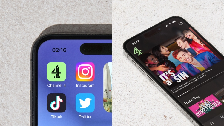
Pentagram redrew the 4 logo to use in a digital context and be readable even in very small sizes. Meanwhile, the brand font family has been expanded with more weights and variations. That, according to Powell, allows each show on Channel 4 to have its unique voice, while staying connected with the common brand.

Channel 4’s general branding is based on four cornerstones: color, iconography, sound, and motion. It is conceived so that people could see or hear three of these elements. With this, the motion principle envisages an animated logo, where the 4 is a traveler moving between different words of content.
When it comes to the color gamma, a shade of green called “vibrant green” is designated to be the main brand color. First of all, it is used for the 4 which will also be displayed with different color gradients representing the channel’s various products.
Channel 4’s audience can already see the new branding across the broadcaster’s assets including the VoD service, the Channel 4 app, and social media. Besides, the channel is soon going to present new identities for its sister channels such as E4, More4, and 4Music.


