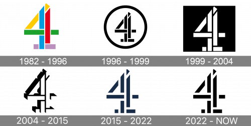
Channel 4 is the name of one of the popular British television channels, which was established in 1982. Although for the most part, it is commercially self-funded, the channel is owned by the state. The most popular shows broadcast by Channel 4 at different times were “Big Brother”, “Friends”, “Big Fat Gypsy Weddings”.
Meaning and history
Although Channel 4 was established at the beginning of the 1980s, it only started covering the whole of Great Britain in March 2010, when it started to be broadcasted in Wales due to the digital switchover. It was created as the fourth television service in the UK (thus the name), in addition to the two BBC services and the only commercial network at the time, ITV.
What is Channel 4?
Channel 4 is the name of a British tv channel, which was established in 1982 and is owned by the Channel Four Television Corporation. The name of the channel literally means “the fourth channel” in the United Kingdom.
1982 – 1996
The very first Channel 4 logo was introduced with the launch of the network, in 1982. It was a very cool geometric badge, created by the Lambie-Nairn bureau. It was a digit “4” composed of numerous straight elements drawn in different colors — yellow, blue, green, red, and purple. This was a very elegant and memorable logo, which looked stylish and bright on a white background, or any other is outlined in white.
1996 – 1999
In 1996 the Channel 4 logo was redesigned by Tomato studio, keeping the shape and style of the original emblem. The new version was executed in a strict and elegant black-and-white color palette, with the recognizable “4” enclosed into a circular frame. The digit got smaller in size and was placed right in the center of the circular badge, looking balanced and professional.
1999 – 2004
The redesign of 1999 was held by a new designer bureau, Spin. The new badge used the reverse color palette, with the white digit “4” placed on a solid black background. The circular shape was gone and now the symbol was set on a square badge, or simply on any dark background without any framing. In this new execution, the badge was looking powerful and brutal, with the straight contours of the elements, forming the “4”, and sharp angles, evoking a sense of progress and confidence.
2004 – 2015
In 2004 the black-and-white Channel 4 logo was refined by 4Creative Rudd Studio. The blocks, forming the “4” got some volume, being shadowed. They also got more space between each other. As for the overall composition, it was still set in black and white, but with black for just outline and shadows of the white elements, while the background could be absolutely in any color or pattern.
2015 – Today
The same agency, 4Creative, refreshed the Channel 4 logo in 2015. Making the iconic “4” flat again, the designer adopted a new color palette — dark calm blue on a white or transparent background. The blocks of the digit became thinner and lighter and got even more space in between, which made the overall image look more elegant and fresh, showing the company’s value of the roots, and its ability to elevate the simple things and implement innovations in all processes.
2022 — Today
The Channel 4 badge, introduced in 2022, repeats the shape one style of the previous version, which is also used along with the new badge today. The main difference between the two logos is the color palette, with the initial version set in the calm and deep shade of blue, and the new one executed in plain black, which looks powerful and distinctive.
Font and color
For its primary logo, the British television channel doesn’t use any lettering, thus there is no official typeface. Although, in some cases, the iconic “4” can be seen with the wordmark in a simple sans-serif font, with medium-thick bars and neat contours.
The blue and white color palette, adopted for the Channel 4 logo in the 2010s, is a representation of quality and stability, creativity, and innovative approach along with the traditional understanding of professionalism and dedication.


