

Launched in 2006, Deezer is a French music streaming service that allows users to listen to the musical tracks of different recording labels, including Sony Music, Universal Music Group, and Warner Music Group. The service’s database currently includes over 90 million tracks and 34,000 radio stations. Deezer has more than 14 million monthly visitors as well as 7 million paid subscribers. Recently, the platform presented new designs for its logo and website. Although Deezer is not as popular as Spotify or Apple Music, its fresh visual identity can surely be named one of the brightest.
![]()
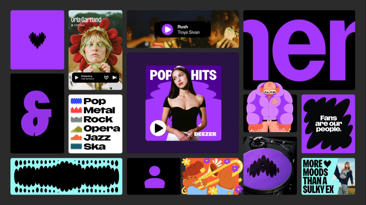
Deezer’s overhauled brand look is built around a heart-shaped logo. This is a bold step from the previous design, with colorful cells representing a graphic equalizer. Created by Koto Studio, the new visual identity is intended to reflect a strategic shift towards a new goal for the brand. With it, the company is repositioning itself as a platform for innovative services where people’s expression and interconnection are guiding principles that help artists, fans, and partners realize themselves through music.
The bright, fresh, and amazing branding introduces Deezer Purple, a shade that, as the company hopes, will be connected with the service just like Netflix is associated with red or Spotify with green.
![]()
On this background, the heart, Deezer’s new symbol, conveys love for music, creating a feeling of involvement. As Koto says, its wavy outline reflects rhythms and impulses. The logo seems to belong to two dynamic conditions: one is rooted in human nature as a heartbeat, and the other is intertwined with music as a musical beat.
Compared to the previous icon, the heart is a more evocative and appropriate symbol, given the inspiring effect of music. The purple color and the heart’s sound wave form prevent it from being a banal image, which is so widely used in graphic design.
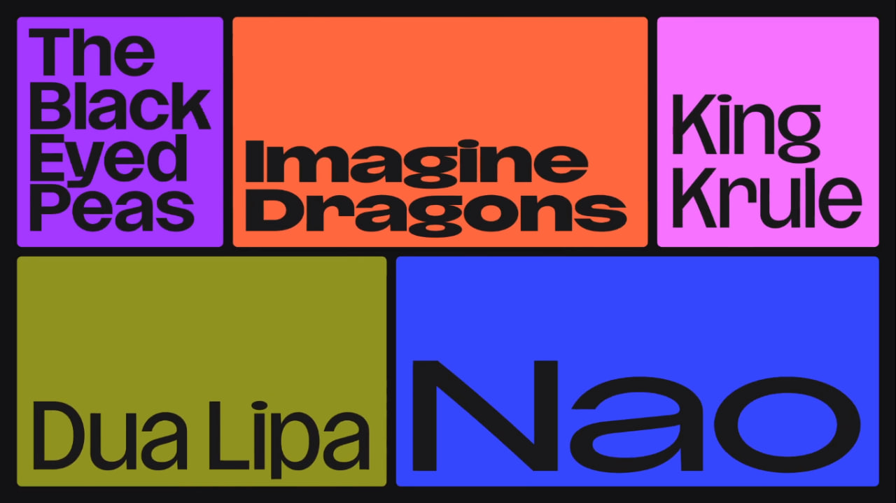
To complement the heart icon, the brand has come back to the all-caps aesthetics it had in its original emblem. The Deezer wordmark is distinguished by solid letterforms with straight edges and smooth curves in the “D”, “Z”, and “R”
When it comes to typography, the brand received its own custom typeface, named Deezer Sans, which was designed in cooperation with Luke Prowse, a founder of the NaN foundry. In its press release, the company describes the typography as an embodiment of the flexibility of a custom font, offering various widths for different purposes, including marketing materials and playlist skins.
Deezer says its identity update provides an opportunity to tell the story of the brand more emotionally, communicating with music enthusiasts, artists, and strategic partners via visual signals that point out that they can feel music to the full.


