Deezer is the name of one of the world’s most popular music streaming services, which was established in France in 2007 and today is available for music lovers from all over the globe. The service has more than 50 million tracks in its library and a monthly subscribers audience of almost 15 million.
Meaning and history
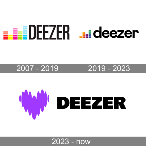
The Deezer logo was redesigned just once throughout the history of the brand, though the original concept of the streaming service’s visual identity has been kept in the modern version, as it brilliantly represents the essence and purpose of the company.
What is Deezer?
Deezer is the music streaming service, which was launched in France in 2007, and by today has grown into one of the world’s leaders in the industry, being available in almost 200 countries worldwide. The Deezer app allows you to listen to music, audiobooks, and podcasts both online and offline.
2007 – 2019
The very first logo was created for Deezer in 2007, right after the brand’s establishment. The logo of the French streaming service featured a bright yet minimalist emblem, placed on the left from the simple and strict black logotype, written in black uppercase letters, executed in a modern narrowed sans-serif typeface.
The emblem of the service depicted a stylized sound equalized in gradient color palette with the squares and rectangles of different heights drawn in pink, yellow, light green, and sky-blue. This vivid and delightful color palette balanced the simple inscription and made the whole emblem look cool and young.
2019 – 2023
The Deezer logo was redesigned in 2019, after a whole decade of using the same emblem. The new visual identity is still composed of a music equalizer scale and a black logotype, but both elements changed their style and contours. The wordmark is now set in the lowercase and though is still executed in a sans-serif typeface, it looks completely different, as the new font is bolder and has fuller shapes of the letters.
As for the graphical part of the Deezer visual identity, the equalized emblem is now formed by rectangles of the same sizes, but slightly different colors. Each of the elements features a gradient surface with shades from orange to blue, placed from left to right.
2023 – Today
The emblem presents a unique fusion of audiovisual symbolism and emotional appeal, representing the brand Deezer. At the logo’s heart is a vibrant purple graphic, reminiscent of both a heart and sound waves, which captures the essence of music’s power to evoke and express deep feelings. This abstract design cleverly marries the intangible joy of music with the tangible science of sound, encapsulating the brand’s commitment to enriching lives through the universal language of melodies and rhythms. Alongside this, the brand’s name is crafted in stark, solid black letters, asserting its presence with a contemporary and assertive typeface that speaks of modernity and digital sophistication. The juxtaposition of the lively emblem with the minimalist lettering creates a memorable visual identity that resonates with the transformative experience of enjoying music, highlighting Deezer’s role as a digital conduit between artistry and audience.
Font and color
The bold lowercase logotype from the Deezer primary badge is set in a font, based on the iconic Futura SH DemiBold, but with the contour of the letter “R” modified — its horizontal bar is elongated and arched, and this is what adds a unique feature to the logo, making it memorable and recognizable.
As for the color palette of the Deezer visual identity, it has orange, purple, blue, and green gradients, reflecting the wide variety of music styles and compositions, available for listening on the platform. The shades are very intense and bright, adding power and energy to the logo, and representing the platform as the professional and multicultural one.


