Founded in 1896, Denmark’s Stark Group unites the largest distributors and retailers of building materials in Northern Europe. Along with Danish enterprises, the firm owns four merchant chains ni Germany, Sweden, Norway and Finland. While transforming to a new business model, the brand has updated its look. Stark Group’s new visual identity is conceived as an “umbrella brand” gathering together all its member companies.

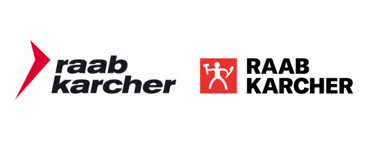
The rebranding, connected with a range of acquisitions and the following reorganization, will concern all the enterprises of the group which will receive a single trademark. The Stark Group’s new logo, inspired by the ancient Nordic petroglyphs, represents a stylized figure of a man, named Anton, who holds tools in both hands.
According to an official statement, with its renovated identity, Stark Group aims to express that the company is assembled as one team working as a whole to achieve a common goal – “to build our future, helping others build theirs”. The company also said that the petroglyph trademark is intended to symbolize craftsmanship. This image perfectly reflects the values of Stark Group.

The umbrella branding is rare in identity designing. One of the reason for that is high costs needed for brand unification. Although Stark Group’s man, reminding the cave art, looks rather unpretentious, we can see a great job behind his simplicity as the designing team’s task was to adapt this image to every brand of the group.


