

Located in the Bronx, the New York Botanical Garden (NYBG) is a special place that has served as a connective hub among people, plants, and the planet for over 130 years. Since its establishment in 1891, the institution has collected more than 12,000 species, representing almost every corner of the Earth. Occupying an area of 250 acres, NYBG offers visitors the opportunity to explore 50 different gardens and plant collections, including an old-growth forest, a cascade waterfall, wetlands, and much more. In an effort to promote awareness of the world’s floral richness and support sustainable initiatives, the institution has introduced a new brand identity, designed by Wolff Olins.
![]()
The NYBG redesign project is centered around the concept “Do Right by Nature”, with the goal of highlighting the active role of nature and strengthening NYBG’s image as a leading environmental organization. This concept also aims to communicate the knowledge and values that visitors can gain from this remarkable place.
Nature-inspired forms can be found in NYBG’s custom typography, which is used for the logo. According to the design studio, the typography should evoke confidence and reflect the institution’s commitment to protecting natural assets. The brand’s color palette is inspired by the NYBG landscape, including the Thain Family Forest, the Bronx River, and the Ladies’ Border sheltered area. Each element of the brand system is intended to symbolize the spirit of the Garden.
![]()
NYBG’s previous logo, a plain wordmark in the Garamond serif font, was far from being a graphic design masterpiece. Created eight years ago by Pentagram, it was a step forward from a rather complicated and outdated design that depicted the dome of the Enid A. Haupt Conservatory, the Garden’s main greenhouse, along with the organization’s full name.
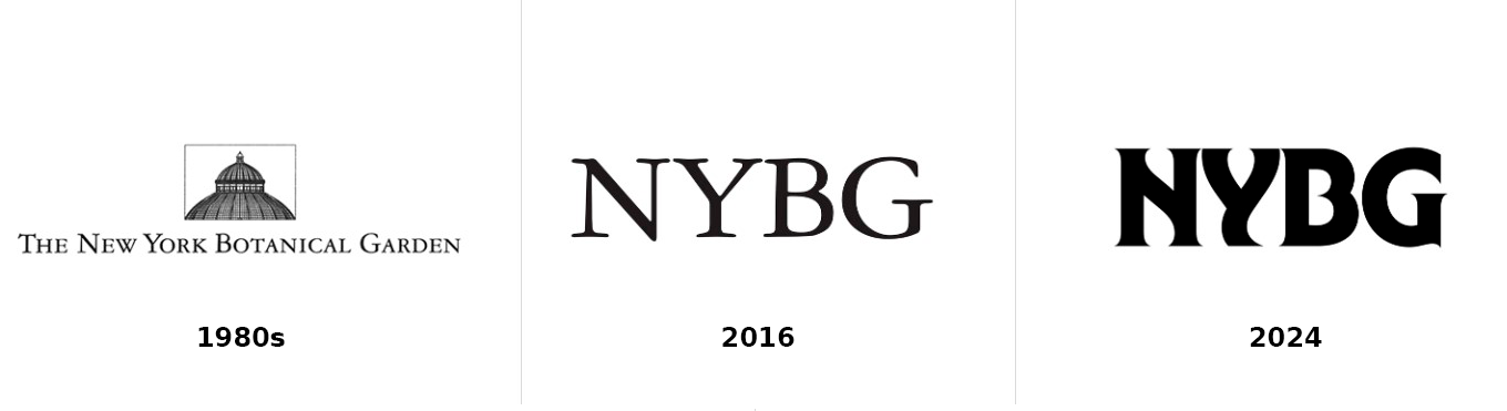
However, considering modern design trends, that simplified and strict logo was insufficient to fully express NYBG’s values and goals. Therefore, Wolff Olins created a new signature inspired by the ITC Serif Gothic typeface by Herb Lubalin and Tony DiSpigna. The new NYBG wordmark features unconventional letterforms, with slight serifs and wavy lines that bring a unique and memorable vibe to the logo. The negative space within the curvy letters becomes more noticeable, while the serifs can be interpreted as a reference to NYBG’s floral realm, resembling petals, thorns, or other botanical elements.
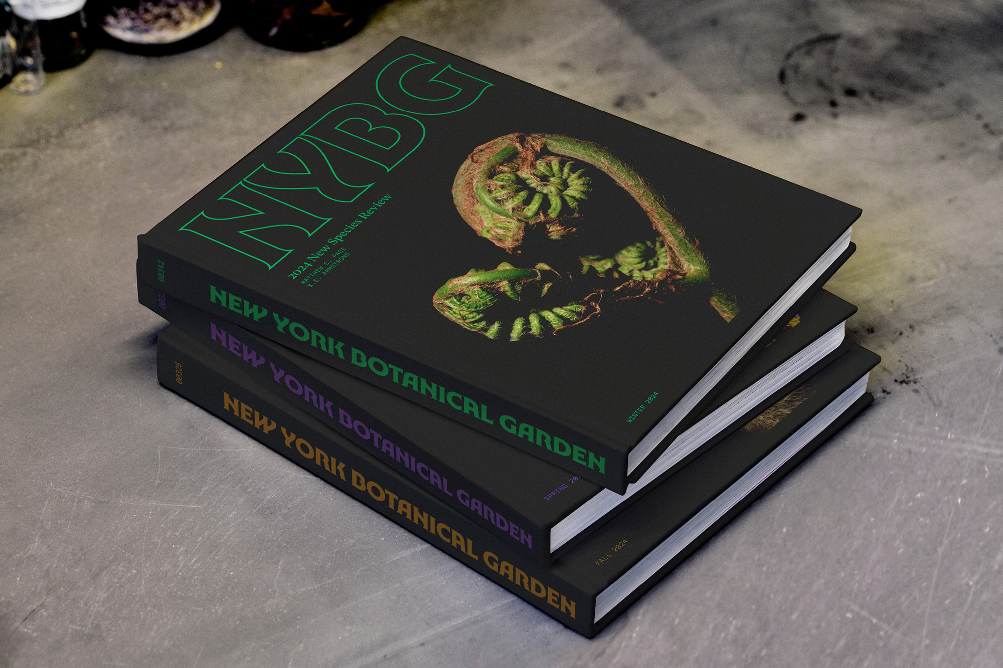
The typography, developed in collaboration with graphic designer Ryan Bugden, creates an even more impressive image when used for the Garden’s full name. The dense arrangement of the letters forms an intricate pattern that resembles stalks and leaves crawling up a wall.
Considering the abundance of plant species in NYBG’s collection, it is no surprise that the brand has adopted a wide range of colors to enhance its visual assets. In addition to the typical green associated with “natural” brands, the color palette includes twenty-two different hues that reflect the diversity of flora.
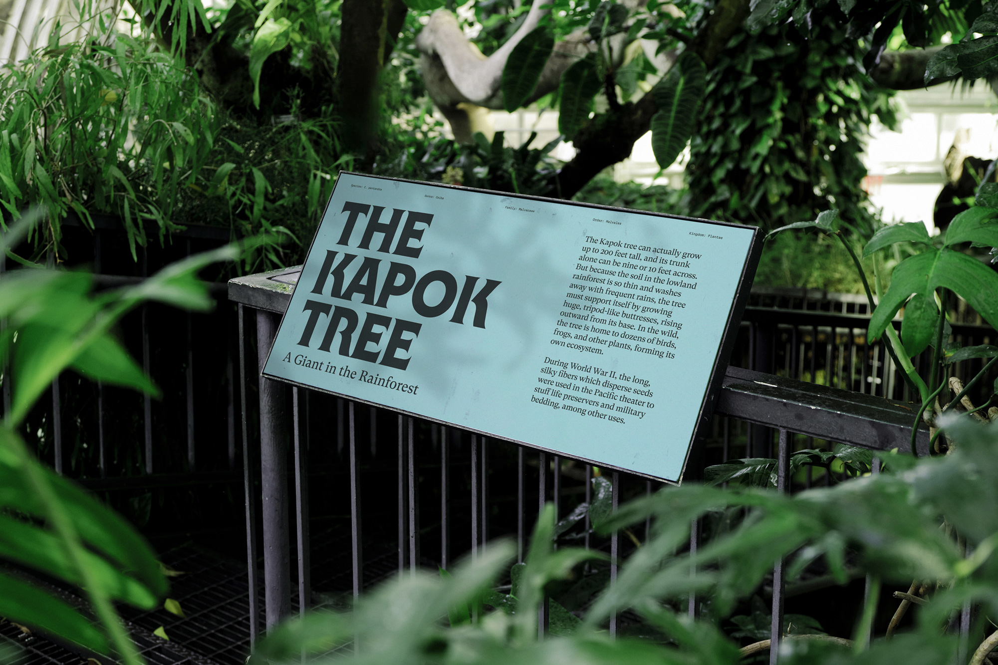
In addition to the logo’s font, the NYBG brand will also use GT Super, a typeface that adds a scientific elegance with its serif aesthetic, making it a fitting choice for the institution’s digital applications.
Overall, this redesign is undoubtedly excellent, resulting in a flexible system that can be applied to various platforms. The typography, color palette, and visual elements come together perfectly to convey the enchanting story of nature that NYBG aims to tell.


