

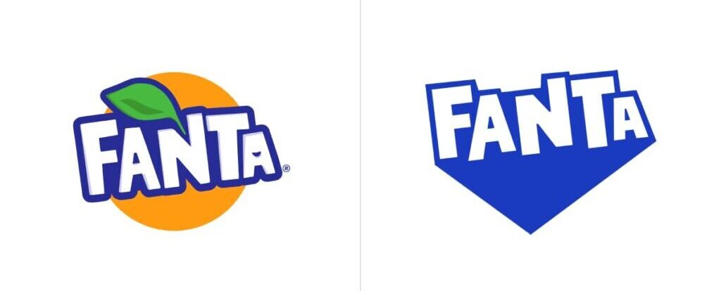
Following Pepsi, another soft drink brand has changed its logo. The famous Fanta emblem has dropped its orange as the company has, in recent years, expanded its range of flavors, including pineapple, lemon, strawberry, blueberry, and grapes. So what’s the whole strategy behind the rebranding?
![]()
In fact, Coca-Cola, the brand’s owner, is trying to build a synchronous and global identity on a new stage of its journey. Within this purpose, Fanta’s look was remastered by Jones Knowles Ritchie, a design agency known for its work with big food & drink brands. The rebranding resulted in a logo distinguished by cornered typography, keeping only blue and white as brand colors.
Besides the orange, the Fanta logo has also ditched the green leaf. These two elements have been customary features of the emblem since 2008.
While being one of the favorite drinks across, Fanta, however, has had different designs for different markets, just like its sibling brand Sprite whose identity was unified just several months ago. In this regard, we can recall a logo, presented in the United Kingdom in 2017, which featured typography, pretty similar to that of the new emblem. Fanta’s British division then decided to update the identity, cooperating with Koto Studio which created a visual system with new colors, imagery, and an unconventional typeface. With this, the Fanta wordmark was designed in a cornered, irregular shape, with triangular shadowing.
With some slight changes, that design was chosen to unify the brand under a single visual umbrella. According to the company, this renovation elevates Fanta to position it equally with the other brands of Coca-Cola.

In addition, the brand’s color palette was supplemented with brighter shades, a real burst of colors that represent different flavors.
Fanta’s new branding also includes a set of fruit symbols. These cheerful and funny visuals look especially cute in their animated versions developed by graphic designer Lucas Wakamatsu. Inspired by the idea to bring this play to consumers of all ages, the new appearance creates a fresher story of how to be enjoyed across all levels, from real life to the digital world.


