

In November 2019, the Chicago Fire carried out the first rebranding in its history. The crown-and-flame logo with the team’s new name, that was presented then, met a harsh reaction from fans, being criticized for an odd design not supporting the club’s traditional symbolism. Now, the team seem to have recognized their missteps as they have updated their visual identity again, bringing back more usual images.
While having had a lot of consultation with its supporters through live meetings and social media this time, the Chicago Fire has returned the St. Florian Cross, a symbol of the patron saint of firefighters, on its logo. In the new iteration, the cross is executed in a clear and simple manner as a circle with four cut-outs, designed a lighter shade of blue compared to the club’s initial emblem.
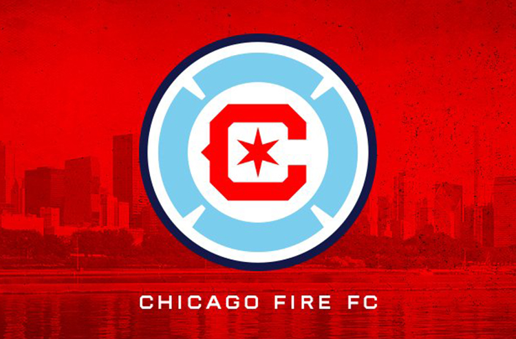
The big “C” in the center, the team’s another revived symbol, is now designed in a cornered style, but still keeps the iconic spike, while the six-pointed star is pretty similar to the stars in the Municipal Flag of Chicago, being an echo of the 1998 crest’s ring with six point. The colors of the cross, “C” and star are also a replication of the colors of the city’s banner.
Overall, the Fire’s new crest can be called a distinctive and laudable move as the team return to their roots in terms of visual identity. While reflecting the club’s traditions and paying tribute to Chicago, the logo shows off a clear and transparent design corresponding with modern trends in logo making.


