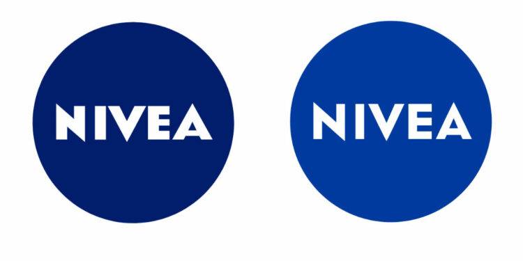
The personal care brand Nivea received a new logo almost six months ago. However, neither Beiersdorf AG, the brand’s owner, nor the media reported the rebranding. The fact that Nivea’s new emblem has widely not been used yet prevented people from discussing it. Although the logotype was implemented in the German website of the brand, the old visual identity is still in use on social media.
Over decades, the Nivea logo has been undergoing rather slight changes. On the other hand, the packaging design was considerably altered for the global markets back in 2013, while the branded blue roundel was defined as an elementary component of the packaging for all the Nivea line-ups.

First thing to notice in the new logo is a lighter shade of blue. On closer examination, you may also see some changes in the wordmark which is designed in a thinner font now, and this makes the spaces between the letters visually larger. Compared to the previous version, the lettering looks airier.
Nivea is one of the few brands that copyrighted its branded color. The Nivea Blue (Pantone 280 C) is registered as a trademark since 2007. However, the status of the new Nivea blue is not clear yet.

Anyway, the fact that the redesigned logo is not consecutively used tells that Nivea is still on the move in terms of branding. According to Beiersdorf AG, the emblem, developed by Peter Schmidt Group, is a result of an ongoing branding process that started in 2020.
The company explained the new Nivea identity, saying the modified hue of blue is livelier and more modern, and the typeface for the wordmark was redesigned for style consistency. Through this new look, the brand is seeking to stand out in retailing, and especially, in the digital field. The reworked Nivea logo gives more contrast, better readability, hence, it is more recognizable while drawn in smaller sizes as well as in digital material and mobile apps.


