

Slipping from Serie A to Serie B at the end of the season, Spezia Calcio seemed to have decided to sweeten the bitterness of its failure by updating its visual identity. However, it has had a contrary effect as many noticed that the club’s new logo resembles a Nazi symbol.
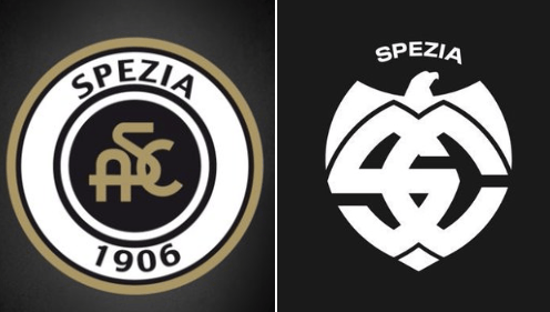
“Anchored in the past, moving to the future”, that’s the slogan under which Spezia Calcio unveiled its new emblem on July 6th. But judging from the feedback it caused, the past and the future of the club seem not so clear.
![]()
Indeed, the presented logo features a specific form of an eagle’s head and wings overhanging stylized letters “S” and “C”, which cannot help associating with fascist iconography. “The new logo of Spezia seems, so to say, too Nazi”, a Twitter user noticed.
Nevertheless, the Ligurian club stated that “the logo was developed for all fans to take pride in”. However, the reaction from fans was not laudatory, according to Italian news agency Ansa. “Awful”, “looks like a Nazi symbol”, and “It’s an insult to our city’s history” are some of those critical comments that immediately appeared on social media.
Spezia’s disappointed fans even created a petition on Change.org, demanding to restore the previous logo. “You can’t just destroy a 100-year-old symbol which made Spezia Calcio glorious”, stated the petition.
It should be noted that some moments in the history of the city of Spezia were highly political. In the Mussolini times, the city was one of the seaports hosting large military facilities. So it was the object of the bombing of the Allies who aimed to defeat fascist troops and their alliances with Nazi Germany. “In a city like ours, that is a symbol of courage and resistance, we don’t deserve to be associated with the dark times when we were denigrated across Italy”, the Football Italia website cites one of the fans.
The crest of Spezia often featured a monogram made up of the club’s initials. In some iterations, the symbol was accompanied by a depiction of an eagle. The previous logo, representing a roundel with a golden rim, was introduced in 2005 to celebrate the centennial of the club.
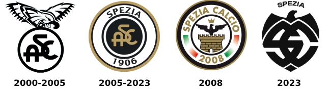
In the summer of 2008, after corporate bankruptcy and the creation of the new ASD Spezia Calcio, the club temporarily adopted a round logo with a Spezia Calcio inscription and an eagle. This emblem was created by a fan who won a competition organized by the municipality of Spezia. A few months later, the owning company regained the right to use the classic Spezia 1906 logo.


