

Established as a spin-off of a food company in 1962, Murray’s Cheese is a food retailer specializing in artisanal cheese and dairy. Beginning as a small shop in Greenwich Village, New York City, the company has grown to have more than 1,000 locations across the United States, and is now part of Kroger Company, which acquired the brand in 2017. Murray’s gained popularity through a wide range of cheeses, including an exclusive cheddar, the Danish Havarti, and the Tilsit cheese.
![]()
Continuing its evolution, Murray’s Cheese has presented its new visual identity, developed by NY-based design studio Base Design. The main concept of the rebranding was to bring the brand’s heritage to modern, digital means of promotion and communication.
Considering the new expansion strategy of the company based on modern technology, the studio defined a direction to translate Murray’s legacy to the language of e-commerce. According to Base Design, the new identity highlighting the brand’s cheese expertise and reachable energy is inspired by the company’s “personally-forward cheesemongers”.

Thus, the redesign is a good example of an encompassing approach with the goal to capture the essential things in Murray’s image. As the result of this endeavor, the new logo design includes swashes and the brand’s founding year, colored in a brighter shade of red.
Murray’s previous logo, created by Pentagram, was introduced 20 years ago. It was a rather nice signature with some vintage motif. The handwriting style was reinforced by a curl in the “M” and a swash in the “y”, which included the slogan “We know cheese”. Those elements have been transferred to the new wordmark, redrawn to have a more contemporary appearance.
Oriented horizontally now, the redesigned logo showcases more compact forms, retaining, at the same time, its traditional retro vibes. Switching to a remarkably serif aesthetic, it looks a bit cheerful, easier to perceive. The y-swash was shortened to give place to “CHEESE” as a rightful part of the company’s official name. In addition, “Est. 1962” designed in a typewriter font emphasizes the heritage theme.
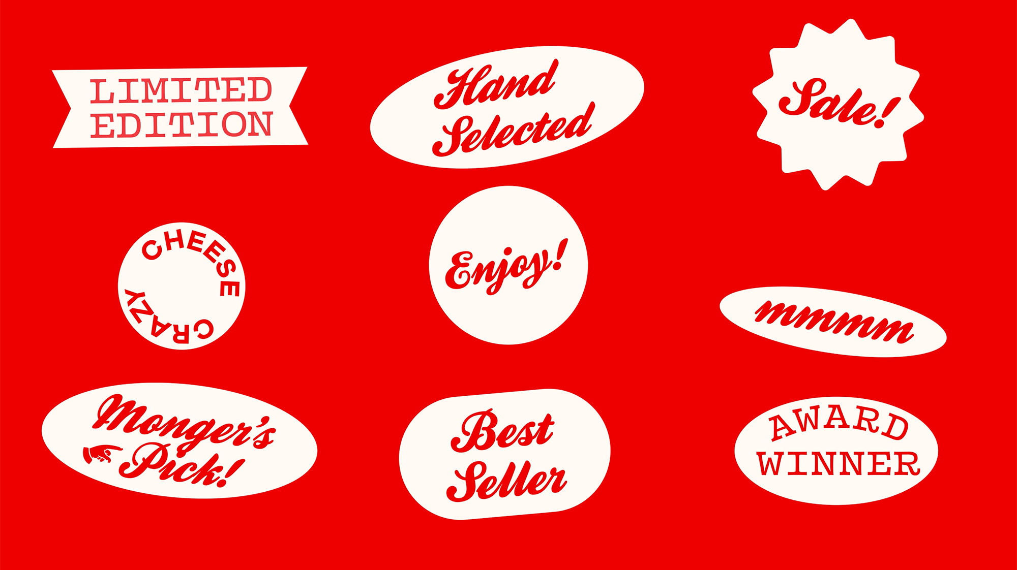
Typography-wise, two main fonts from the Colophon Foundry are applied to the brand identity: Brick Pro, an expressive serif typeface intended for headlines, and Mabry, a warmly felt sans which is to type technical texts. Murray’s typographical asset also includes Kestrel Script and Vulf Mono chosen to maintain good texture and versatility.

Playful illustrations featuring “cheese characters” help Murray’s express its cheese-making experience and joyful spirit of the brand. They also symbolize this or that type of cheese, telling, in a way, the story of Murray’s. Thus, these cheeses make up a visual system that is both functional and appealing.
Apart from the main red color, used for the logo, the color palette includes a number of hues corresponding, in particular, with Murray’s cheese products. Differently combined with the brand’s four fonts, they can create different impressions in the visuals.

The rebranding of Murray’s is really exemplary in terms of respecting heritage, which is undoubtedly important for a brand with a 62-year history. Base Design have surely managed to grope a perfect way to modernize the company’s look, not only saving the essence of the traditional identity, but also adding new elements in such a manner that they strengthen the feeling of the respectful oldness of the brand.


