

The premium soft drink brand Minute Maid has updated its visual identity six years after the previous rebranding. It’s been a global work that involved four design agencies: Jones Knowles Ritchie, Grey, VMLY&R, and Landor&Fitch.
![]()
Since the brand was founded in 1945, the Minute Maid logo has gone through only five iterations. The goal of the current overhaul was to unify the design, giving the brand a common identity in more than 100 countries where it is present today. Different product names are planned to be unified as well, depending on the market.
The Minute Maid logo has kept its general design, with a black background, dropping, however, the green top.
Thus, the emblem looks flatter, featuring a more rounded typeface in the spirit of the original design of 1945.
And again, we meet the tendency of the moment that brings back simple forms through which the brand gets a retro effect as a nod to the past.
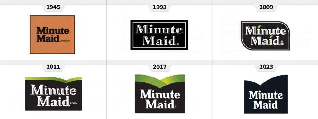
One of the interesting aspects here is typography. Although it still supports a serif font, the outlines of the letters are more curved, with smoother serifs at the ends. So the logo abandoned the “caving effect”, with better volume and readability.
As we saw in the recent rebrandings of soft drink brands, the logo is not the most important thing in Minute Maid’s visual identity. The brand’s fresh look is made up of two elements: a rich and bright color palette and a large set of images. These features are crucial in new packaging, showing off a wide range of flavors. The branded imagery depicts abstract fruits which were originally painted with an airbrush and a stencil.
![]()
According to a statement from the company, the new Minute Maid identity aims to evoke a sense of enjoyment or, as the brand’s global strategy director Katalin Czigler explains, to express the opportunity of feeling good.
In general, the changes make the brand more relevant, while the Minute Maid logo is clearer now. Showcasing more readable typography, the white lettering against the black wordmark is perceived as more consistent, without the visual noise of that green bordering. And that’s what our eyes appreciate when we see a brand signature on a colorful package.


