

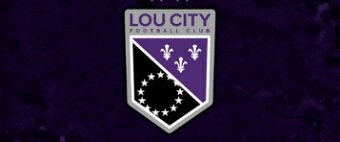
The Louisville City FC unveiled a new logo this Monday. The team also changed its colour scheme in new design to white, gray and black shades, complementing the trademark purple hue. Besides, the primary crest included main elements from Louisville’s city flag, such as the circle of stars and the fleur de lis.
 According to the team president Brad Estes, one of the rebranding aims was to pay homage to the city, while trying to create a new look that will be bright and clear. Moreover, the updated crest was an additional sign of the club’s continued growth and achieved results. In the new logo it was obviously reflected a close connection of the club with Louisville.
But the negative reaction of fans on the social media that followed the new club’s mark unveiling made the team refuse of using the revamped crest. The other variant of the logo is planned to be developed before the stadium opens in Butchertown this spring. As expected, the soccer stadium construction will be completed before the team’s 2020 season.
Howie Lindsey, director of public relations for Louisville City FC, acknowledged that the old crest was dear to many fans. He stated that the old mark will always be a part of the team’s history, which represents championships for them and is loved by the players.
 The retracted emblem was developed in cooperation with Louisville-based advertising company Doe-Anderson Inc. The collaboration lasted about three-months, and around 100 variations were created and rejected during the period. Making the new logo design will also be entrusted to Doe-Anderson Inc.
This Thursday Estes said the rollout of the new brand has been stopped as well as production of merchandise, featuring the new crest. Those who purchased merchandise with the dropped logo if wish can return it to get a full refund. The merchandise will be accepted at the team store located on Fourth Street.


