Minute Maid is an American brand of juice manufacturer, created in 1945 and owned by Coca-Cola. The brand is distributed all over the world but has different names from country to country. Today the label produces also various soft drinks and lemonades.
Meaning and history
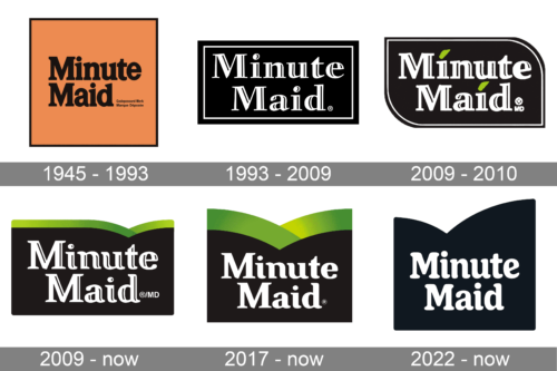
The Minute Maid visual identity was always text-based and featured almost the same color palette throughout the brand’s history. Only the very first Minute Maid logo was different from the others.
The brand’s roots can be traced back to 1945 when Florida Foods, Inc. was founded. Today, the range of beverages sold under the name Minute Maid includes lemonade, orange juice, and various soft drinks.
1945 – 1993
The original Minute Maid logo looked pretty boring with its brown-black palette and the name of the brand given in a generic serif type. Moreover, it included tiny writing in its bottom right corner that was almost illegible at smaller sizes.
1993 – 2009
While the design hardly became vivid, it grew at least simpler. The lettering now better fitted the shape in which it was placed.
Once again, the company used a serif type. Yet, the shape of the letters was slightly altered and black highlights appeared adding some depth. The 3D elliptical dots above the “i’s” could be interpreted as an attempt to make the design at least a little more cheerful, which would have perfectly fit orange juice and lemonade.
2009 – 2010
The version made an even more obvious step towards cheerfulness by replacing the ellipses with green leaves. Also, the designers introduced a dynamic drop-like shape with rounded corners instead of the old rectangle.
2009 – Today
Another attempt at making the design fresher and introduce a natural feel resulted in a green layer above the wordmark. The smooth wave was inspired by the shape of a leaf. The type grew softer and more rounded, which only reinforced the connection with the botanic theme.
The logo was developed by Duffy& Partners in partnership with CMA Brand Presence.
2017 – Today
The company uses an austere black-and-white design although the logo with the “leaf” top can still be seen.
2022 – now

Although green has been featured in Minute Maid logos since 2009, the company returned to a black-and-white color palette in 2022. The curves at the top of the base now had different shapes, with the left being smaller and the right being larger and going noticeably higher. The font has also changed. This version has a more rounded typeface that resembled Boardwalk Condensed. Despite all the changes, the logo remained recognizable thanks to the use of a similar inscription style and the base’s shape.


