

Established in 1928, Real Valladolid is one of the prominent football clubs in Spain. The team have played in La Liga, the nation’s football top tier, over 40 seasons, having the titles of the winner of the Copa de La Liga and Copa Real Federación Española de Futból. Recently, the club has refreshed its visual identity including a logo with simpler patterns, custom typography, and a color palette. Some details of the new look put an accent on the club’s past.
Real Valladolid’s new crest is only a part of a comprehend rebranding carried out by the London-based design agency FutureBrand. It includes multiple details and nods referring to the city of Valladolid, such as the new corporate typography called Pucela after the city’s nickname, or the revamped color gamma with the yellow-and-red flame connected with the history of Valladolid.
Since its inception, Real Valladolid has used a crest similar to the coat of arms of the city. Although the emblem was changing over time, it has always featured a closed crown inherited from the Real Union Deportiva (Royal Sports Union), five flames, five castles symbolizing the region of Castile, and six violet and white stripes for the club’s traditional colors.
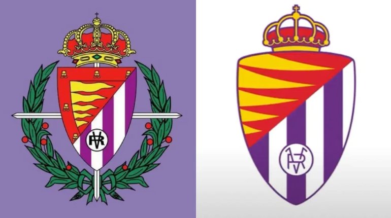
In 1962, the City Council allowed the team to add the Laureate Cross of Saint Ferdinand, a symbol of a Spanish military order, granted to the city by Francisco Franco in 1939. However, it was this element that was removed in the recent rebranding as it is, probably, associated with the times of Franco’s dictatorship.
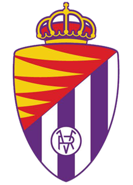
Remastered, the RV shield has a simpler structure, closer to the original version of 1928. It retains its triangular form, but the lower part was somewhat widened to look more solid. The flames-and-castles field was replaced with a bigger and smoother drawing of flames. The corners were rounded, while the crown is a bit smaller now. The RV monogram was redesigned accordingly to the general view.

According to FutureBrand’s explanation, the reshaped crest resembles a heart, becoming a symbol of life and passion for the club. With a simple design, it will undoubtedly be more recognizable and readable on all kinds of materials, including the digital environment.


