

It turned out to be that Gmail is not the only Google service which has received a new logo. Presenting its new G-Suite project, the company has also unveiled updated emblems for the Calendar, Drive, Sheets and Meet. With an integer visual style, the services are united under the Google Workspace brand.
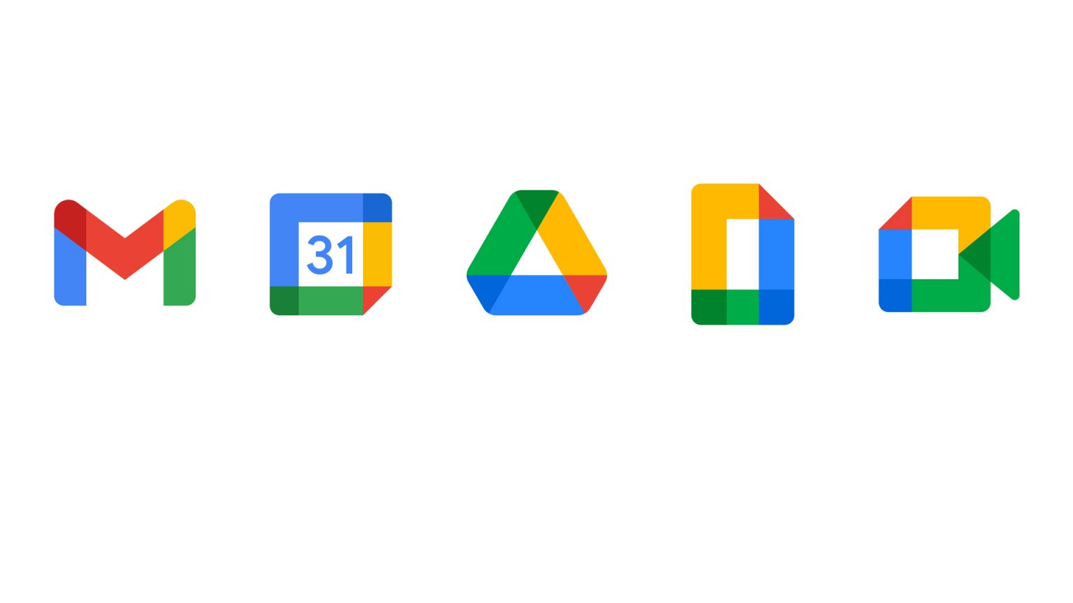
The unifying design motifs are Google’s four-color scheme and the color overlapping in the corners of the icons that makes them perceived a bit three-dimensional, albeit it doesn’t eliminate the flat look in general.
Also, we can notice that the corners themselves have grown more rounded. This is particularly evident in the Google Drive logo. In addition, it is the only emblem of the five which maintained a three-color palette (yellow-green-blue) in its previous version, and adopted only a red corner in the new iteration. At the same time, the most changes can be seen in the Calendar logotype. Dropping the gray rear element and two-tone flipping effect, it represents just a flat square now.
With all this, some experts remark that, while this design consistence makes the brand identity cleaner across Google’s services and applications, such a logo overhauling is rather an ambiguous solution, as being displayed on a smartphone screen, all these icons can visually mingle in one colorful mix, confusing users for a few moments.


