

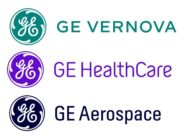
The multinational conglomerate General Electriс has presented the brand identities for its three divisions as a part of the upcoming reorganization of the group. GE Healthcare, GE Vernova, and GE Aerospace, which will be independent of each other, have received their own logos.
In November 2021, GE announced that the group would be divided into three divisions (health care, aviation, and power engineering) as independent public companies.
The unveiling of the emblems, which took place a few days ago, is an important milestone in the history of GE. And the three divisions will enjoy the rich traditions of the GE brand. According to the corporation, the establishment of three separate companies allows them to improve focusing on their activities, fund allocation as well as flexibility for growth and price formation.
And here are the details on the newly created companies and their identities.
GE Vernova: the company’s name is a combination of “ver” that derives from “verde” meaning “green” and “nova” meaning “new”. The name the Evergreen color symbolizes the beginning of the innovation era of low-carbon energy which will be provided by GE Vernova.
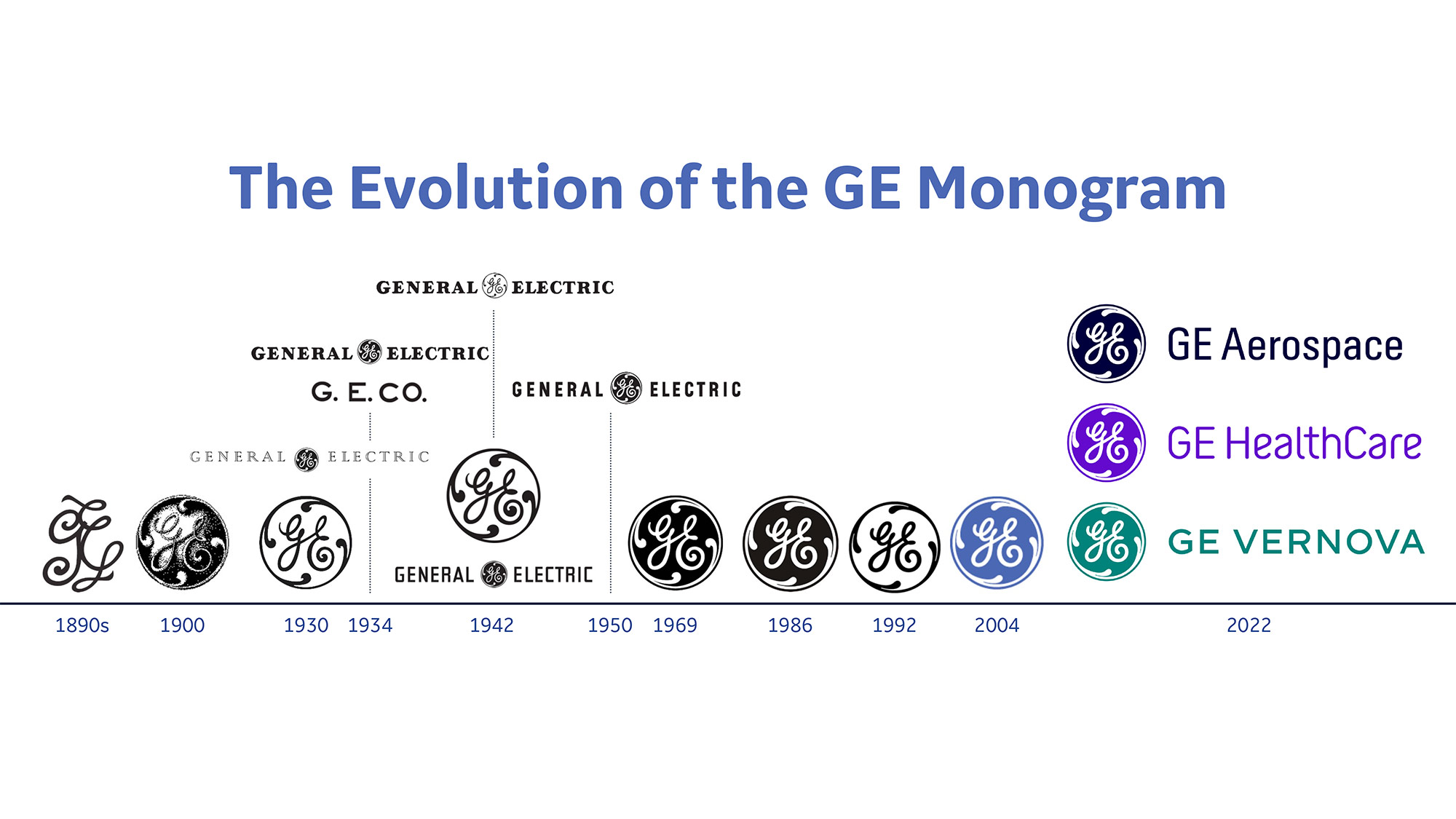
GE HealthCare: the name of the company’s new brand color is “Compassion Purple”. It has to reflect humanness and warmth.
GE Aerospace: the GE monogram for the air and space company is designed in a blue-to-black shade. The color known as Atmosphere Blue is inspired by the upper bound of the earth’s atmosphere. The company will continue holding strong positions in the aviation industry while developing a confident view of the space sector. GE Aerospace keeps the rights to the brand GE, while GE HealthCare and GE Vernova will get long-term brand licenses.


