

Having a more than 80-year history, the chocolate brand M&M’s is launching a new rebranding, announcing a strategy oriented towards public communications, inclusiveness and diversity. To emphasize these values, the new identity focuses on the brand’s recognizable ampersand.
![]()
M&M’s new look was created by Jones Knowles Ritchie, a prominent design agency known for its works with big food brands like Burger King and Baskin-Robbins’. Including a lot of details, the project deals not only with visual branding but also a verbal image and the storytelling about M&M’s individuality.
Fulfilling its mission, JKR developed a flexible visual identity that allows the creation of multiple meaningful combinations and is able to inspire joint fun. With it, the brand’s iconic ampersand was rethought as a symbol of togetherness, according to the designing team. In the facelifted M&M’s logo, horizontally oriented now, the sign takes a central role.
The agency also refreshed the brand’s color palette, celebrating the rich gamma of M&M’s chocolate candies. The candy colors have become brighter in the new visual system.
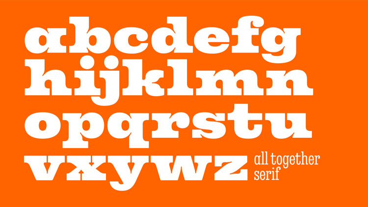
However, the most remarkable thing about the new branding is a custom typeface with letterforms making reference to the iconic lentil form of the M&M’s chocolates. For the first time in its history, the brand received its own font family called All Together. This new typeface mirrors fun with an eclectic combination of weight and width. The details with curves and bubbles tell about smiles and balls reminding the classic shapes of M&M’s.
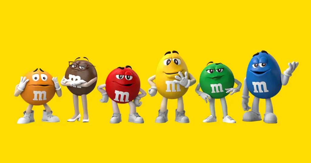
The famous M&M’s characters, which debuted in 1954, have been renovated as well. Following the new strategy of the brand, the mascots are adapting their profiles to the present as their evolution was entrusted to BBDO, an international advertising agency. The Red, for instance, will be less imperious. The Yellow will calm your anxiety. The Green offers more confidence, changing high boots to sneakers, while the Brown has switched from spike heels to low-heel shoes and new glasses.
Overall, the M&M’s rebranding resulted in quite a nice visuality. The well-developed typography and brand system create an interesting and cheerful story, while the refreshment of the characters allows the brand to adjust to customers’ demands.


