

Officially established in 1834, Eichhof is a beer brand that is popular in the central Switzerland. Acquired by the Netherlands’ Heineken in 2008, the Lucerne-based brewery produces 11 different beers. Beside lager, its production line also includes such craft beers as the turbid natural Klosterbräu, ale-like Hubertus or strong Barbara (alc. 6,5%). To modernize its image, Eichhof hired the British design studio Pearlfisher that renovated the brand’s visual identity.

In their work, the Pearlfisher designers were inspired by a table they found in the brewery. It featured engraving of different traditions of Eichhon as well as a blank section for future symbols. This gave the team the idea of the “Neue Traditionen” project that would unite the brand’s heritage and innovations.
According to Sam Lachlan, Perlfisher’s design director, the team took Eichhof’s traditional squirrel as the central part of the rebranding. Moreover, they revived its original design the company used 50 years ago, additionally creating letterings and other elements in the squirrel’s style distinguished with bold black strokes. On the emblem, which will mark brand bottles and cans, the Eichhof wordmark is accompanied by “Braukunst” (a German word for “Art of brewing”) and the inscriptions “Art of brewing since 1834” in French and Italian, two other state languages of Switzerland.
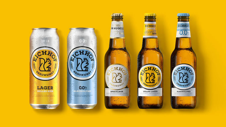
While Eichhof’s new visual identity has kept its brand yellow color which, along with the new design, fits more for the brewery’s specialty beer choice, the black-and-white patterns look more harmonious, considering the brand’s spirit of experimentation.


