

Launched in 2008, Foursquare is a mobile app providing users with personalized recommendations of places to go near their current location. It also offers check-in features which allow people to share their location in social media, using text messaging, a website or a device specific application. With its growing user base with over 500 million devices, the Foursquare developing company decided to rebrand to show it is something more than just a check-in app.
To overhaul its look Foursquare hired PlayLab, a Los Angeles-based design studio, that developed the service’s new identity based on its activities and current level in terms of business and technology.
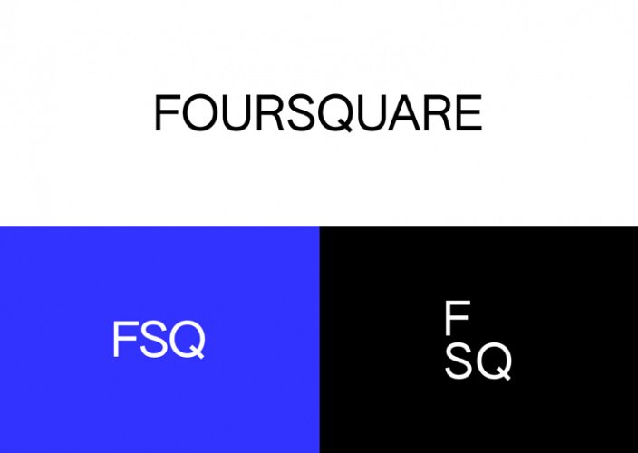
While the previous Foursquare logos looked quite generic, featuring a cartoon character or representing a simple lettering (in the latest iteration), the updated visual identity of the service includes a new wordmark in the Authentic Sans 90 typeface, complemented by the FSQ abbreviation. As David Godycki, the art director of Foursquare, says, this design creates a scalable system retaining the company’s traditional playful style. In addition, such a laconicism fits well for a modern business.
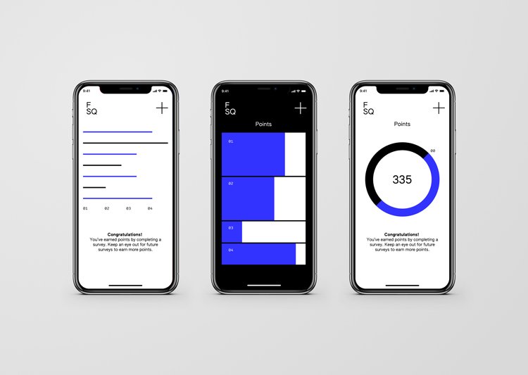
The other features of Foursquare’s brand identity include the app’s visuals, icons and promotional materials, distinguished with a special design with a black and blue color palette. According to the company, the combination of the hues reflects “digital wayfinding”, one of the cornerstones of Foursquare.
In general, Foursquare’s branding conveys the idea of data collecting and information processing, offering good-looking and readable visualization.


