

Founded in 1976 in Lille, France, Decathlon is the world’s largest company involved in producing and retail trade of goods for sports and outdoor activities. As of today, the brand operates more than 2,000 stores in 56 countries and regions. A new strategy of Decathlon, aiming at making “innovative and sustainable sports products” available for everyone, led the firm to the creation of a fresh visual identity that will express its commitments through a new brand color and a new symbol – The Orbit.
![]()
Decathlon’s rebranding, in fact, is no surprise, as the brand has been sharing its renovation plans since January 2022, when Barbara Martin-Coppola, a former IKEA digital director, became the CEO of the company. By the summer 2023, it became clear that Decathlon was going to reduce the number of its sub-brands, retaining only the most popular, like Quechua (outdoor activities), Domyos (fitness & martial arts), and Tribord (water sports).
When it comes to the identity overhaul, the new look was developed by Wolff Olins in cooperation with AMV BBDO. Although it saves the old Decathlon wordmark, albeit a bit adjusted, the visual system also offers an icon, a first for the brand. While the redesigned “Decathlon” still showcases the traditional connection between the “C” and the “A”, the round symbol seems to echo this distinctive feature of the design.
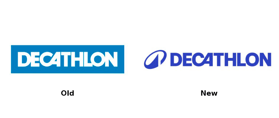
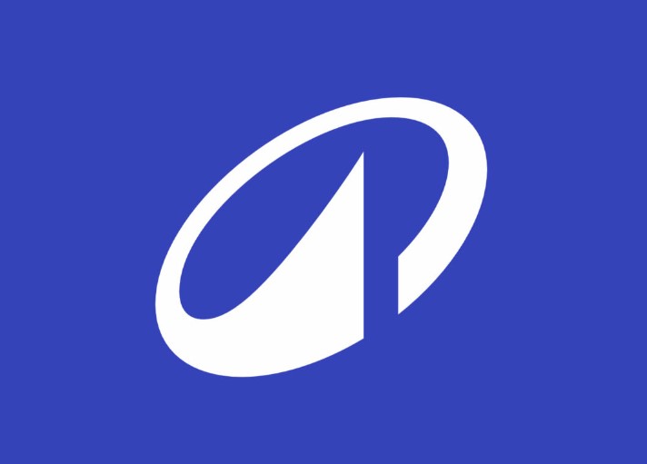
According to the retailer, this new symbol, named The Orbit, will play an important role, appearing across different touchpoints of the brand, as well as on Decathlon products themselves. Graphically, it represents an unclosed oval form tilted to the right, with one end widened into a triangle in the inner space. Decathlon says the icon is to symbolize the company’s aspiration to achieve new heights within the circular economy that is adopted as a core model of the business.
Additionally, a different, darker shade of blue was introduced to improve the readability of the design, along with the wider spaces between the letters in the wordmark. In this regard, the studio created a unique typeface, Decathlon Sans, that was inspired by the peculiar angle in the “A” and also includes a set of alternate characters distinguished by this special slope.

Overall, the rebranding is a real refreshment of the brand that has finally received a compact signature. The oval symbol itself offers a lot of room to interpret. A simple design makes The Orbit easy to remember. The icon’s connection to the circular economy is also understandable, as, apart from being a symbol of dynamism and motion, it closely resembles the recycling arrow, which makes it a proper symbol of all the values of Decathlon.


