IKEA is a Scandinavian furniture manufacturing company, which was created in 1943 in Sweden. The corporation specializes in the design and production of ready-to-assemble pieces and has more than 400 stores across the globe. The brand is extremely popular for its modern design and affordable prices and is the number one interior shopping destination for millions of people worldwide.
Meaning and history
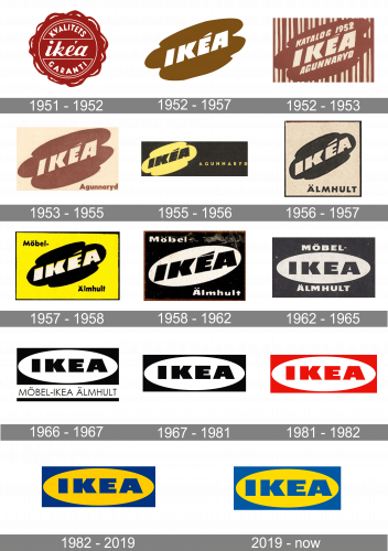
IKEA is the company that boasts a very impressive number of its visual identity redesigns. The brand started experimenting with its logo in the 1950s and since then the new badge appeared every 1-2 years, until the redesign of 1982 when the company finally chose its corporate style and palette.
What is IKEA?
IKEA is the name of a Swedish furniture brand, which was established in 1943 and today is considered to be one of the most famous furniture manufacturers in the world, due to its affordable pricing policy and stylish collections of furniture, textile, and home accessories.
1951 – 1952
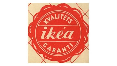
The original IKEA logo, introduced in 1951, stayed with the company for only one year and featured a sleek traditional red wax-seal with a thin white outline and lettering. The wordmark was written in the lowercase cursive and placed horizontally in the middle of the emblem, surrounded by the “Kvalitets Garantí” (the quality guarantee) lettering in capitalized sans-serif.
1952 – 1957
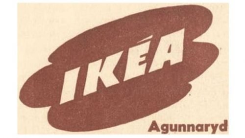
The IKEA logo, which was in a use for five years in the middle of the 1950s, featured a smooth and calm image with the white uppercase lettering in an extra-bold geometric sans-serif, placed diagonally on an abstract cloud-like badge, set in a soft shade of brown. The banner was also set diagonally, balancing the direction of the wordmark and creating a sense of motion.
1952 – 1953
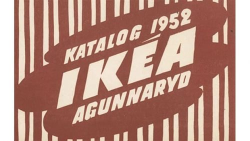
The redesign of 1952 brought a new look to the IKEA logo, which boasted a diagonally placed extra-bold inscription in all capitals, placed on a rounded abstract background with a puddle-shape. The original color palette featured light brown and cream shades. The brown emblem was initially placed on a background with numerous vertical stripes of different thicknesses.
1953 – 1955
In 1953 the logo was simplified and its background turned light beige with no patterns. The “Agunnaryd” tagline was added under the emblem, in the bottom right corner of the logo.
1955 – 1956
The color palette was changed in 1955, and now the yellow emblem with black lettering was placed on the left part of a horizontally stretched black rectangle. The “Agunnaryd” inscription was enlarged and placed on the right from the emblem, executed in all capitals of a lightweight geometric sans-serif.
1956 – 1957
In 1956 the emblem becomes black, while the lettering and the square background are turned light beige. The “Almhult” tagline was written under the emblem in all capitals of a bold sans-serif font.
1957 – 1958
The new logo was introduced in 1957 for the first furniture line of the company. The iconic emblem was colored black and placed on a bright yellow background with a black strict outline. The “Mobel” on top and “Almhult” on the bottom was written in a title case, in black. As for the emblem itself, the wordmark in it was refined and softened, and its white letters gained a yellow outline, which balanced the brightness and contrast of the logo.
1958 – 1962
The “puddle” shape turned into an oval in 1958, and the bright yellow shade was switched to white. The composition remained the same, though now the background was in black, while the oval — in white. The black “IKEA” lettering was refined and strengthened, with its massive letters shapes clean and strict.
1962 – 1965
The glyph above the “E” was removed in 1962, and the typeface of the logotype was changed to a more delicate one. The diagonal orientation of the inscription turned into a horizontal one. The “Mobel” and “Almhult” letterings were enlarged and placed closer to the oval emblem.
1965 – 1967
In 1965 the color palette of the logo turns monochrome, and the additional lettering moves under the main emblem, a white oval in a black rectangle with black lettering inside. This was a very modern and powerful badge, which actually became a prototype of the emblem we all can see today.
1967 – 1981
The tagline was completely removed from the IKEA logo in 1967, though all the other elements, including the color palette, remained unchanged. The contours and lines of the wordmark were refined to give the logo a more professional and brutal look.
1981 – 1982
The color palette of the IKEA visual identity was changed to red and white for only one year. It was a completely new color combination for the company, which aimed to shows the passion and power of the Scandinavian furniture brand.
1982 – 2019
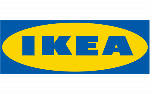
Another color palette change was made in 1982, and this time IKEA found its perfect combination — yellow circle placed inside a blue rectangle and blue lettering in the middle of it all, this is the scheme, which represents the company at its best, pointing on happiness, ease, reliability, and safety.
2019 – Today
The redesign of 2019 brought a darker shade of blue, looking more serious and solid than the one from the previous version, but still evoking a light and pleasant feeling.
Symbol
The existing IKEA logo represents the company’s name (blue characters) placed inside a yellow ellipse, which, in its turn, is placed inside a rectangular shape. The rectangular shape features the very same tint of blue as the letters.
Emblem Criticism
Although the IKEA emblem is instantly identifiable, quite a few designers criticize it for being severely dated. Hardly a surprise taking into consideration that IKEA has been using almost the same insignia since 1967.
For instance, the design company Freytag Anderson even created an experimental updated IKEA emblem for the Icon magazine. Preserving the bold type and the color scheme, the designers opted for a cleaner font and got rid of the oval claiming that it spoils the legibility at smaller scales.
Font
The wordmark in all capitals is executed in a custom bold typeface, which is probably based on Magnum Sans Serif Extra Black, but with tiny, almost invisible, sharp serifs, which add play fullness and sophistication to the thick lines of the letters.
Color
The blue and yellow colors of the logo are also the colors of the Swedish flag, so they remind of the company’s origin. The combination was first used in 1977 and became official in 1983.
What does the IKEA logo represent?
The IKEA logo is a depiction of the company’s name, which in turn stands for the name of its founder, Ingvar Kampard, and the place where he was born, Elmtaryd Agunnaryd. The brand’s name is set in a heavy sans-serif font, a symbol of confidence and stability, and executed in a yellow and blue color palette, which symbolized energy, and loyalty, and also repeats the colors of the Swedish flag, showing the company’s value of its roots.
Why did IKEA change their logo?
The latest redesign of the IKEA logo, which was held in 2019, has made the name of the brand brighter and more readable, which also gave the company more possibilities and option in placing the badge in the digital materials. It was made my refining the contours of the letters, adding a bit more air to the composition, and lightening up the color palette, creating a lively welcoming image.
What font is the IKEA logo?
The super heavy uppercase lettering from the primary IKEA badge is set in a custom typeface, created exclusively for the brand, and called Ikea Sans. There is some resemblance with such commercial types as Generation Headline Extended Mammoth, or Taz Extended UltraBlack, but with some modifications of the contours.


