

The British confectionery company Cadbury has updated its logo for the first time in fifty years. The redesign that comes along with a new packaging for the brand’s Dairy Milk chocolate bar is a part of the rebranding program launched a year ago.
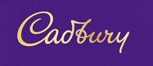
Cadbury’s iconic logo, however, hasn’t been changed much. Derived from the signature of William Cadbury, who was a grandson of John Cadbury, the brand’s founder, the emblem has received a finer design with straight lettering. Apart from the thinner letterforms, it is distinguished with a loop in the “b” from the old logo.
According to the official information from Cadbury, the refreshment’s goal was to bring a more modern look into the brand. As the company’s statement say, the revitalized Cadbury signature gives a more contemporary perception.

At the same time, Cadbury denies the rumors that it paid £1 million for the rebranding. While the company said the cost was “nowhere near £1 million”, it didn’t ascertain the precise figure.
While published, the new logo met a mixed reaction online. Some people described the logo update as “the most pointless”, noticing that the “u” and “r” together look like a “w”.
As for the new Dairy Milk packaging, it was redesigned in a simpler style, featuring the iconic glass-and-a-half theme. The revamped Dairy Milk will first appear on the Australian market in May. For consumers in the United Kingdom, it will be available in 2021.


