

Swiss telecommunications company Sunrise, re-established after the merger of the UPC cable TV provider and the Sunrise mobile service company in late 2020, is unifying its brands. Sunrise is designated to be the basic brand, receiving a new visual identity.
![]()
According to the company’s press release, all the products, provided today under the brands of Sunrise and UPC, will be united under a single name and visual design. In the future, the merged company will manage a set of brands including Sunrise, MySport, yallo, Lebara and swype. So, the UPC brand will disappear from the market. With this, the company Sunrise UPC, which has been a part of the US corporation Liberty Global for two years, will keep its current name.
The offerings, currently provided by Sunrise in the mobile, TV, and web fields, have been restructured simultaneously. As the company says, the integrated brand-new offering will be useful for customers. And this integration is an important milestone for Sunrise UPC.
From the moment of the UPC and Sunrise merger, this move has been highly expected by market observers, While Sunrise, Switzerland’s number 2 of mobile telephony, was considered a more successful company, UPC was suffering from quite serious network failures. So both divisions are hoping to improve the services and get positively inspired with a new logo and slogan “Dream big. Do big”.
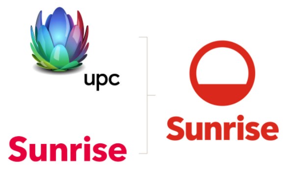
The UPC brand logo, which has been used since 2017, will gradually be removed from screen, at least with the “UPC”. Back in 2012, it received its colorful design as a part of the UnityMedia repositioning. However, a monochrome version of the emblem will stay a symbol of Liberty Global.
While the old Sunrise company used a wordmark logo, the reformed brand has been supplemented by a special sign called Aurora. It symbolizes “an endless horizon of new opportunities that every new sunrise brings with it”, as the company said, presenting the new visual identity.
![]()
Although the logo has a rather simple design, it is amazingly self-contained. It is clear, remarkable, flexible, scalable, and visually attractive. What else does a logo need? And besides, it can easily be identified as a sunrise, additionally explained by the wordmark.
The design is a result of the collaboration between the Zürich-based studio Thjnk and designer Rufus Leonard from London.


