

Last year’s winner of the CONCACAF Champion Cup, the Seattle Sounders FC, has unveiled its new visual identity, created by the Seattle-based design studio Column. The club is considered one of the most successful teams in Major League Soccer, having on its account four titles of the winner of the US Open Cup as well as the Supporters’ Shield (2014) and the MLS Cup (2016 and 2019).
![]()
Although the Sounders joined MLS only 14 years ago as a new expansion team, they trace their roots back to 1974, when a club with the same name started to play in the North American League. While that team was folded in 1983, another Sounders era was from 1994–2008, connected with second-tier leagues like the APSL, A-League, and USL First Division. Now, the club enters a new stage of its journey with a fresh look, which, however, pays tribute to its heritage.
Remastering the Sounders’ brand, Column tried to save the traditional symbolism of the club. So, the crest has received a new design, including a stylish wordmark distinguished by a wavy separation in the word “Sounders”, and a modernized color palette. The branding was also complemented with a series of tertiary signs inspired by the club’s traditions and history. Besides, the updated wordmark gave an idea to create a custom typeface that harmoniously supplements the brand language, combining different styles of the past and future.
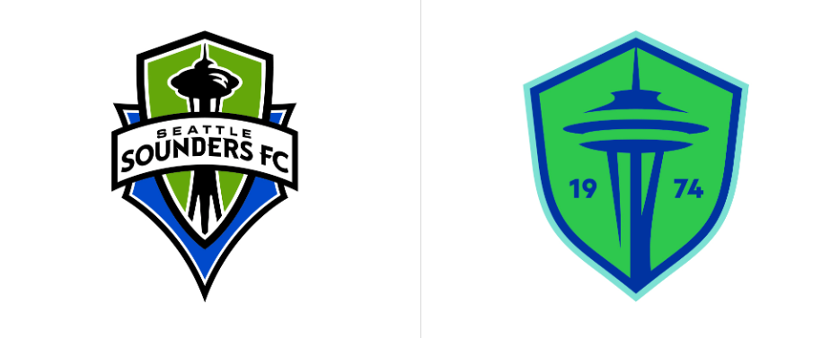
Actually, the new logo of the Sounders still focuses on the iconic Space Needle, the main landmark of Seattle. While the crest itself has become visibly rounder, the construction is executed in a simpler manner, with fewer strokes. Instead of the team’s name, the shield now includes the Sounders’ founding year on both sides of the tower. According to the studio, this design conveys “the club’s commitment to the city, its fans, the game, and the world it inhabits”.
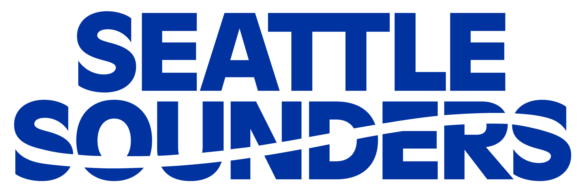
Ditching all the inessential elements, the emblem showcases a rather good-looking composition. Through a larger empty space within the shield, it feels lighter and cleaner. This impression is supported by a simpler color set of contrasting blue and green. The wave in the Seattle Sounders wordmark is, in fact, a revived feature from the previous logos the club had had throughout most of its history.
The family of tertiary marks includes the club’s symbolic images like the “74”, “SFC” shorthand, a rose with “1974”, and an orca with a football. These are a great asset that can be perfectly used in promotion and merchandising.

Sound, the club’s branded typeface, is developed to combine the perfect lines of geometric fonts like Futura with the pragmatic forms of the Grotesk typefaces. The entire typographic set echoes the Sounders brand language, based on the wordmark’s letterforms. This part of the branding was partly inspired by the typography the club used in the 1970s.
All of this together is clearly the result of thorough work that also considered the opinions of the club’s players, stakeholders, and fans. Maintaining the heritage of the Sounders visual symbols, the brand system brings more modern touches that take the club forward.


