

As this year’s Geneva Auto Show has been canceled due to the threat of the coronavirus epidemic, some automakers have to content themselves with their own more modest events while presenting their new cars. So, BMW has unveiled its new i4 concept with an electric engine at a simple press conference. Apart from the sleek exterior and powerful eco-friendly motor, this electrocar has been distinguished with a new BMW logo.
![]()
Compared to the classic BMW logo changed last time in 1997, the new emblem can be regarded as something really new. Keeping its iconic blue-and-white roundel, it has changed the customary black rim to a white one. Following the current trend, the logotype has received a flat design. That reminds of the same solution we saw in the new Volkswagen logo last year.
The tendency of making logos flatter is connected with the need to promote products on digital platforms. Probably, the German automaker will use its new emblem in advertising and communication while its cars will mainly carry the current logotype. It’s a reasonable decision especially as the white-band logo will be hard to read on non-black vehicles.
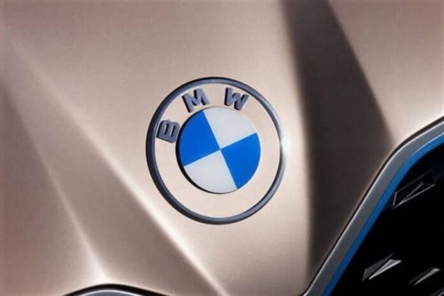
As BMW’s chief management officer Jens Thiemer said, the company is striving for closer relationship with customers, and its new emblem is intended to convey clarity and openness. While the white design means transparency, the logo will be used to invite people to join the BMW community.
Meanwhile, BMW denies the connection of the blue-and-white checkers with aircraft engines despite of the fact that it was founded as aircraft engine manufacturer in 1917. Instead, the company says that the emblem refers to the flag of Bavaria. Perhaps, by arguing this, BMW wants to avoid any allusions to its military activity in WWII.


