

As part of the preparation for the United States Semiquincentennial, the nation’s 250th anniversary to be celebrated in 2026, the America250 Commission has unveiled a special logo for this event. Created by the prominent design studio Chermayeff & Geismar & Haviv, the anniversary symbol aims to “help people engage with a national celebration at a crucial moment.”
![]()
It is worth mentioning that the presented design is not the first attempt at creating a Semiquincentennial logo. In 2022, the organizational commission adopted an emblem featuring the number 250 in a currency-style typeface. However, this design was later deemed unsuitable for display on digital devices and lacked the expression needed to convey the idea of national unity and pride.
![]()
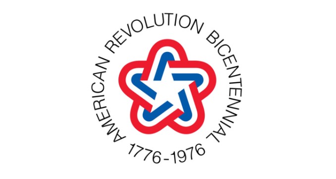
To create something more vibrant and inspiring, the commission turned to Chermayeff & Geismar & Haviv, who coincidentally worked on the Bicentennial logo in 1976. The emblem for the American Revolution Bicentennial showcased a star composed of red, white, and blue stripes, representing the U.S. national colors. It also included the circular inscription “American Revolution Bicentennial, 1776–1976,” giving it an official and governmental appearance. Now, fifty years later, the studio has the opportunity to replicate its success with a modern touch.
For the studio, it was a rather challenging task to capture both celebration and commemoration in the logo. In an attempt to merge these concepts, the design team ultimately returned to their stripe/ribbon concept. According to Sagi Haviv, a partner at the studio, the ribbon is a fitting element for a celebratory design due to its versatility, being used in both formal ceremonies and fun parties.
In the anniversary logo, a red, white, and blue ribbon delicately forms the number 250. The design exudes dynamism and fluidity, evoking a sense of vibrancy and cheerfulness. It deviates from strict geometrical figures and is perceived as a trace of a human gesture, as Haviv explains. This distinctive feature is complemented by the lettering “America” in a custom serif font.
When discussing the America250 brand, the designers draw a comparison to the anniversary of half a century ago. The 1970s were challenging times, and the Bicentennial served as a significant event for Americans to reminisce about past glories and regain faith in their country. In this analogy, the Semiquincentennial is expected to bring a breath of fresh air into national life, serving as a revitalizing and unifying moment in the history of the United States.


