

Lately, changes of logos have become regular and make a lot of noise, like those of Juventus or Inter Milan. Such rebrandings often aim to develop the club image, and we know that today, people play football off the field too, holding huge marketing stakes.
However, crest changes are not executed just with a twist of the spanner – usually, this is a sign of an upcoming new era. And that is the case of the Angers SCO that is about to enter a new stage after the dismissal of its famous couch Stéphane Moulin who has worked with the team for ten years.
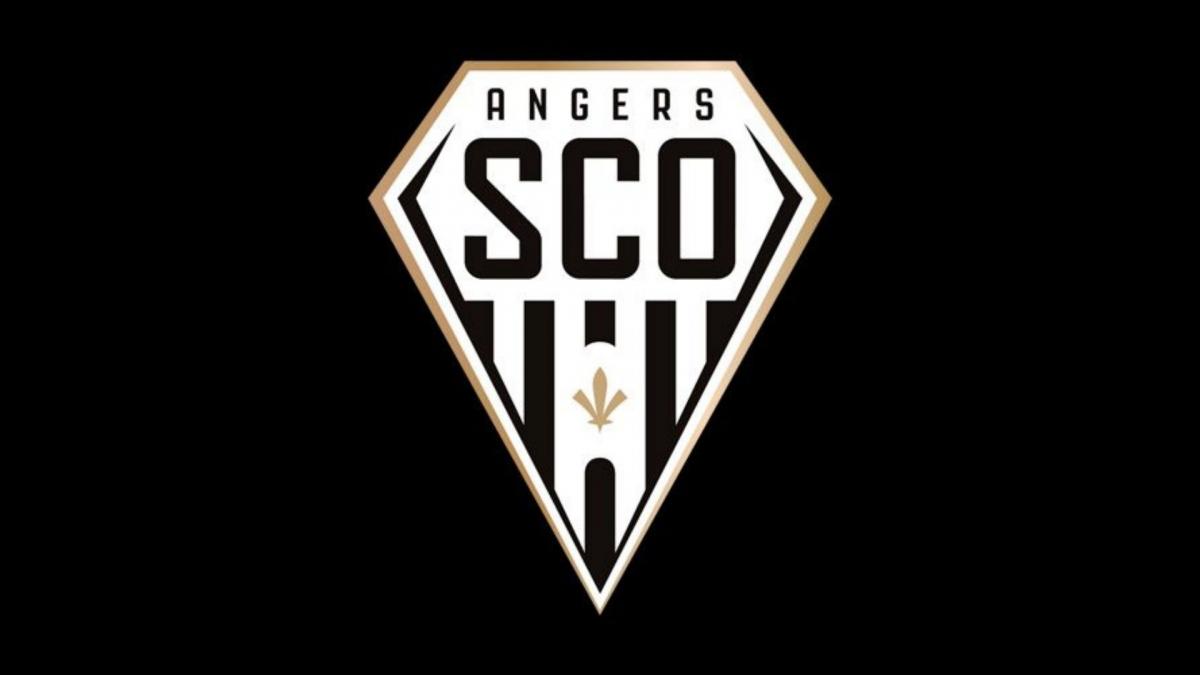
So, the Angers’ updated logo shows a new turn in the club’s journey led by Said Chabane now. If fans are afraid to see a minimalistic emblem, remembering the renovations of the Inter or Juve, they may calm down as it’s far from it. The Angers developed its logo in cooperation with its supporters, keeping the club’s DNA in the design. The emblem was presented at a fan meeting on May 19th.
The SCO’s crest retains its traditional black-and-white color set as well as the gold hues for the bordering. The diamond became “polished” as it received thinner lines and dropped the back shield. The fleur-de-lys in the center is a new element. It symbolizes the French royalty and makes a play with the heritage of the Anjou territory. Behind the flower, we can see a kind of an arc which represents the gate of the Château d’Angers (Angers castle) between its two towers.


