

![]() Angers Logo PNG
Angers Logo PNG
Angers is one of the French football clubs, playing in Ligue 1. The club, nicknamed “Les Noires et Blancs”, after the colors of its emblem, was established in 1919, and today has Stephane Moulon as the head coach.
Meaning and history
![]()
The visual identity of the French football club has been pretty consistent throughout the club’s history. Black vertical stripes became an inevitable element of their logo, supporting the team’s nickname. Another feature of all the logo versions of the club is strong and sharp geometry, which has always been there but changed its contours.
1919 — 1994
![]()
The logo, which was used by the club until 1994 is a basis for today’s version. It was composed of a diamond-shape crest in a delicate gold outline. The body of the crest featured two vertical black stripes and three white ones, each of them was also outlined in gold.
The “SCO” wordmark in gold was placed on the upper part of the crest, inside the white trapezoid. That was a strict and modern emblem, which could be placed on any background and stay stylish and eye-catching.
1994 — 2004
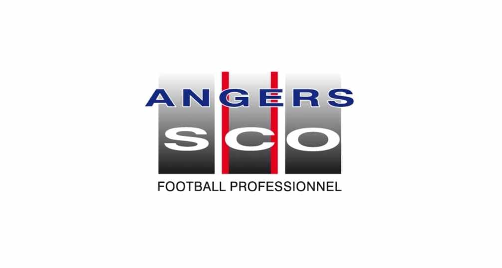
In 1994 the completely new version of the emblem was created. It boasted a different color palette and structure, but the iconic stripes and monochrome combination remained, just in a different interpretation.
The new emblem was composed of three wide vertical lines in gradient gray and black, each of the stripes featured one of the “SCO” letters in white. The “Angers” inscription in all capitals was colored blue and placed on the upper part of the badge, crossing the stripes.
The middle bar with the letter “C” was framed by two vertical red lines, leaving white space between them and other bars.
This logo version stayed with the club for ten years and is the only version with a different color palette. Red and blue additional colors here add a sense of passion and reliability, while the traditional monochrome shows strength and professionalism.
2004 — 2011
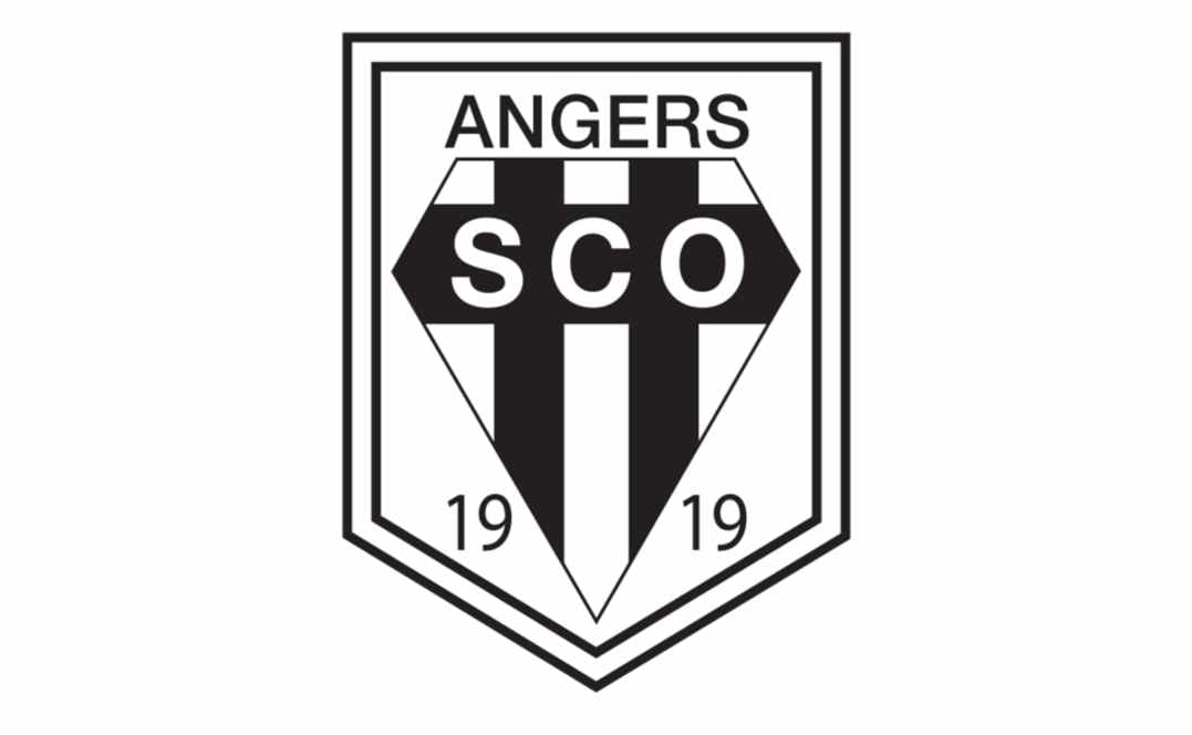
The club comes back to the diamond crest in 2004. The gold outline is removed, but the crest is now placed on the strict straight shield banner in a double black and white frame.
The “Angers” lettering in all capitals is placed above the diamond and executed in a thin and elegant sans-serif typeface, which adds lightness and style to the whole image.
The “SCO” wordmark is now placed on a black horizontal bar, which crosses the vertical stripes of the crest.
Another new thing on the club’s emblem is the “1919” date written on the bottom side of the badge, from both sides of the diamond.
2011 — 2021
![]()
In 2011 the logo gets redesigned again. The gold accents come back, but only in two smooth diagonal lines, framing the bottom part of the diamond.
All the contours were redrawn in a more modern and sleek way, which made the badge look stylish and chic.
The “1919” is now written vertically on the middle white stripe of the crest and is balanced by an elegant yet strong and confident “Angers” inscription in a bold sans-serif typeface.
2021 — Today
![]()
This design used a lot from the precious shield emblems, except with some changes. Notably, it was just the shield now, cropped along the immediate edges and given a golden outline. They moved the ‘Angers’ bit onto the shield (onto its top section), made the ‘SCO’ acronym bigger and black.
The black lines also became slimmer, as well as more elegant in this one. Moreover, they’ve added a little French lily in the center.
Angers Colors
BLACK
PANTONE: PMS PROCESS BLACK C
HEX: #000000
RGB: (0, 0, 0)
CMYK: (70, 50, 50, 100)
WHITE
HEX: #FFFFFF
RGB: (255, 255, 255)
CMYK: (0, 0, 0, 0)
GOLD
PANTONE: PMS 12-2 C
HEX: #D9C395
RGB: (217, 195, 149)
CMYK: (15, 21, 46, 0)


