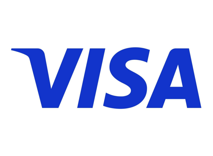
The payment services provider Visa is refreshing its brand look. The updated visual identity symbolizes the changes and illustrates the wide capabilities of Visa, as it is stated by the company.
Founded in 1976, Visa is now considered the most valued enterprise in the financial industry. According to the company, it wants to be seen not only as a company maintaining credit card services, but also as “a reliable network stimulating world trade”. Visa has long been standing for confidence, safety, acceptance and inclusion. According to an official press-release, these values, along with the goal to give everyone an opportunity to take part in the global economy, will be expressed in the modernized and dynamic visual identity of the brand.

Seven years ago, Visa used the start of the Olympic Games (the company has been “a global Olympic partner” for a long time) to alternate its trademark. And the changes, unveiled a few days ago, partly bring back the Visa design which was used before 2005, including the tricolor card symbol as an addition to the main logo. The Visa wordmark itself received a new shade of blue.
Visa’s renovated brand identity is a part of the company’s global marketing campaign launched at the start of the 2020 Tokyo Olympic Games. The Meet Visa campaign focuses on “numerous opportunities and resources offered by the Visa network as well as the promotion of the global economy integration”.

The brand evolution, presented by the company, shows how the color of the Visa wordmark has been changing. In the new iteration, it is designed in ultramarine blue, called “new blue”, without any color gradients. The blue-white-yellow “flag” the company had since inception to 2005, has, to some extent, been revived, and will be used as so-called “brand symbol”. Additionally, Visa has introduced a new corporate typeface purposely developed for using on digital platforms.


