

The logo of 7Up has undergone a considerable change, strengthening the assets of the brand with a new visual system. The rebranding, carried out seven years after the previous facelift, is connected with a new global positioning for PepsiCo’s popular lemon-lime-flavored soft drink.
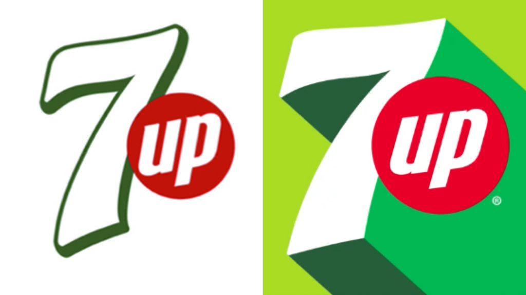
The package design got simpler, showing off a minimalistic style. The same goes for the new 7Up logo which has graphically become flatter in a way, getting rid of some elements, like the green bordering of the 7. Remarkably simplified, the outline of the digit now has less crookedness, which was previously emphasized by the roundness of the corners. So it feels more solid and vigorous, with sharper corners and straighter lines.
However, the roundness was changed to a different design solution – a shadowing that is in accordance with the brand’s new color palette and reinforces the perception of the 7. It creates a dramatic effect, serving as a contrasting background for the red roundel with a bigger “Up” inside. The shadowing with different colors enhances the contrast for the lines. This visual interplay allows us to perceive the figure as moving forward and up. With all these changes, the 7Up logo has acquired a clearer dimensional appearance.
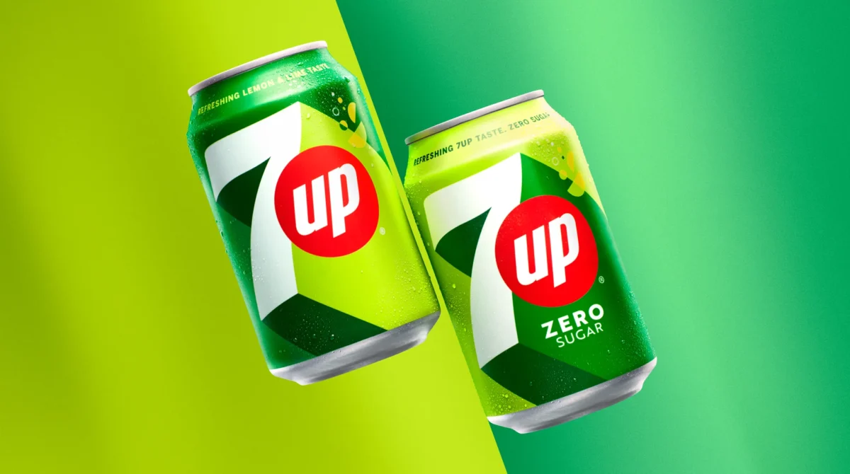
While the design retains the iconic 7Up green, the color palette was expanded with new “piquant citric shades which bring a new vibrant and elevating feeling to the design and, at the same time, show the freshness of its unique flavor”, according to a press release.
As is the case with brands with a global presence, the 7Up logo is also adapted to different markets and languages, including Chinese, Hindi, and Thai. The reason for that is because local consumers cannot always identify even short words in Western languages to feel free to buy the products of the brand.

The logo and the whole visual identity are intended to better reflect the essence of the brand. Repositioning itself under the slogan “UPliftment”, 7Up is aspiring to serve as an escape from the routine of life. The company offers a language which is more versatile, encompassing all possible points of contact.
As PepsiCo’s senior vice-president and creative officer Mauro Porcini explains, “UPlifment is a concept that resonates with people over the world. Above all, our new visual identity for 7Up is inspired by the fact that the brand has created UPlifment moments over its history”.

7Up’s rebranding has been carried out by PepsiCo’s in-house design team. The brand’s new visual system and logo will be seen publicly from March on the packages of 7Up and 7Up Zero.


