Nesquik is a Swiss brand of an instant chocolate drink, established in 1948 by Nestle. The brand got its name in 1999 and today is one of the largest and most recognizable instant-cacao labels in the world.
Meaning and history
The name of the instant cacao brand number one in the world, Nesquik, is formed from the name of the mother company, Nestlé, and the word “quick”, which emphasized the main characteristic of the new product: the cacao powder dissolves very quickly in milk, even is the milk is cold.
The brand of chocolate drink was created in 1948 as Nestlé Quik. Today the visual identity of Nesquik is associated primarily with its main character, the Quickie Rabbit, who has been given his name after the original name of the brand. In Europe, the mascot is called, Quicky the Nesquik Bunny, and in the United States just Nesquik Bunny.Quicky Bunny first appeared in 1973 as the hero of the “Quik” drink commercial.
What is Nesquik?
Nesquik is the brand of the world’s most famous cacao brand, which was established in Switzerland at the end of the 1940s. The brand, owned by Nestle, got its current name in 1999, and today it is synonymous withits favorite kids’ drink, instant cacao, known all over the globe.
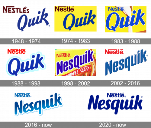
1948 – 1974
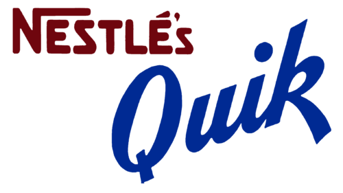
The earliest Nesquik logo reflected the product’s original name. On the top, you could see the word “Nestlé’s” in brown. There was the iconic “N” with the extended top end, which can be seen in the current Nestlé logo but actually was not present there in 1948 (it appeared only in 1984).
The word “Quik” in dark blue could be seen below. It featured a dynamic type inspired by handwriting. the “k” had an extended bottom right end, which provided a casual (“quick”) touch. The diagonal orientation of the wordmark only reinforced this impression.
1974 – 1983
The product’s popularity was growing, and it did not need the parent brand to be promoted anymore. As a result, the role of the “Nestle” part of the logo grew smaller, while “Quik” moved on the forefront.
The word “Nestle” now featured the same blue color as the “Quik.” The handwriting influence became less obvious, as did the casual effect. Even the “k” grew slightly calmer.
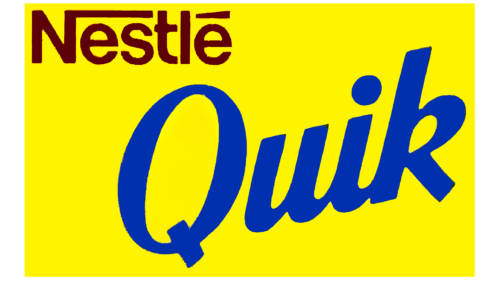
1983 – 1988
In this design, they moved the ‘Quik’ part in the middle of the yellow space and made it bigger. The ‘Nestle’ bit became blue. Furthermore, they also added a picture of the flowing milk in the background.
1988 – 1998
The word “Nestle” grew red, which reflected the transformation of the parent brand’s identity.
The “Quik” logo was modified only slightly. There was a shift in the way it was tilted, and a light blue trim appeared around the letters. It added some depth and made the design lighter, happier.
1998 – 2002
The name “Nesquik” started to be used worldwide. The name of the parent company remained part of the Nesquik logo. It was still red but now grew a little smaller.
The blue color and casual style of the main part of the design were preserved. However, the links between the letters disappeared. The glyphs grew less rounded, which was necessary to make the wordmark more compact.
The “Q” remained capitalized so that the consumers have enough time to get used to the updated name of the product.
2002 – 2016
The “q” was eventually lowercased, which made the wordmark smoother. The letters grew somewhat lighter and adopted white highlights, due to which the logo got more depth.
2016 – Today (International), 2018 (debut in North America)
The word “Nestle” became blue again. The type of the word “Nesquik” was a new one. It was softer, more rounded, although still compact. The letters, except the initial, grew lower. A playful drop replaced the ellipse above the “i.”
Also, the shade of blue grew somewhat warmer, and a gradient was introduced.
2020 – Today
This design uses the same words as the predecessor, except without all the lighting and shading. Plus, they are darker, not skewed and aligned centrally one beneath the other.
Font and Color
The smooth and friendly title case lettering from the primary Nesquik badge is set in a custom-rounded cursive typeface with massive characters looking airy and lightweight. The closest fonts to the one, used in the Nesquik insignia, are, probably, Kari Italic, or OT Puppy Bold, but with the contours of all characters softened and modified.
As for the color palette of the Nesquik visual identity, it is based on a bright and intense shade of blue with some light gradients, which add volume and motion to the image, and work great when the inscription is placed on a solid yellow background of the brand’s product packaging.


