While the logo of the toy brand NERF has always been built around the name of the label, the design itself hasn’t been consistent – it has gone through quite a few notable modifications.
Meaning and history
Nerf is a brand of toys best known for its art guns (the so-called blasters) shooting ammunition made from special foam. As of early 2021, it belongs to Hasbro.
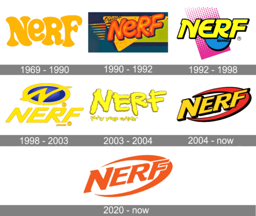
The Nerf logo has always been dominated by the name of the brand in large letters. For most of its history, the letters were yellow. While there have been at least five modifications so far, you can clearly see to basic styles. The older “childish” style showcases a creative, playful font with “dancing” letters, while the newer “sporty” style focuses on italicized and more regular shapes.
1969 – 1990
The history of the brand can be traced back to 1969, when Reyn Guyer, a games inventor, suggested Parker Brothers an indoor version of a football game. By then, the brothers already developed a polyurethane foam ball that was perfect for such a game.
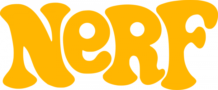
The logo placed on the earliest products contained nothing but the word “Nerf” stylized as “NeRF.” Each of the letters had been drawn specifically for the brand. Looking at the playful, irregular glyphs, you can feel that their style resembles the wild style of kid’s drawings. The combination of the lowercase “e” with the capitals is characteristic for the kids who are only learning to write. The design is cheerful due to the bright and light color.
1990 – 1992
The updated Nerf logo lost some of the playfulness and irregularity of its predecessor. On the one hand, the letters still looked as if they had been drawn by hand. Yet, this was now a more skillful hand of an adult, and it wasn’t even trying to imitate a kid’s drawing.
While the center of the glyphs remained yellow, red trim and darker shades were added. Due to this, there was now more depth.
Behind the wordmark, a combination of yellow and green rectangles appeared over the blue background.
1992 – 1998
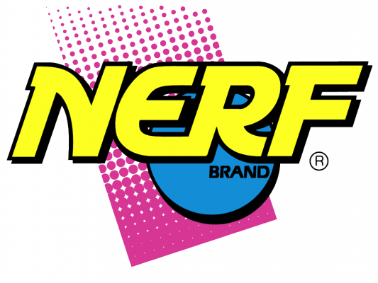
The type became even more “grown-up.” Now, the letters didn’t look as if they had been written by hand. And yet, they preserved their unique and artistic touch. You can feel it, for instance, in the creative “serifs” in the upper parts of the “N,” “R,” and “F” or in the way the diagonal bars in the “N” and “R” were replaced by curves.
In the background, a blue circle appeared, which was probably inspired by the company’s first product, a foam ball. Behind the ball, there was a purple shape with straight angles and multiple white dots.
The logo looked less friendly than its predecessor and not childish at all. Only the super bright colors still echoed the playful character of the previous designs.
Also, it was rather dynamic due to the italicized type and the diagonal direction of the purple shape. The circle didn’t look static – it was probably supposed to be a ball that had just rebounded from the ground.
There was also a simpler version, where the ball was red, while the purple shape was removed.
1998 – 2003
The design started to look more professional. Yet, there wasn’t a “toy” or “childhood” feel about it – it was more of a sports logo.
The typeface lost the unusual curves and serifs. Instead, it was a more generic italicized font. The link between the “E” and “R” added a unique touch, though.
Above the wordmark, there was an emblem, where a dynamic “N” was placed over a blue ellipse in a yellow oval border.
2003 – 2004
This version was the most “childish” of all. It looked as if it had been drawn by someone who has only just learned to write. Also, the lines of the glyphs suggested that they had been drawn with a finger using a fluid paint.
2004 – Today
 The sporty feel returned to the Nerf logo, and even the childish light blue was replaced by a nobler yellow with a brownish tint. There was even a red swoosh emphasizing the sporty feel.
There is also an alternative logo. It appears darker due to the addition of the blackish background behind the wordmark.
2020 – Today
Font
The type featured on the current NERF logo is called Letraset Crillee. It was crafted in 1980-1987 by Dick Jones, Peter O’Donnell, and Vince Whitlock and published in the ITC library.
Color
The logo has been comparatively consistent in its color palette. Starting from the very first version, the main color has always been gold or yellow. However, it hasn’t always been the same tint. While some versions featured only yellow, others boasted a more diverse palette.


