

![]() National Breast Cancer Foundation Logo PNG
National Breast Cancer Foundation Logo PNG
National Breast Cancer Foundation is one of the leading American organizations dedicated to fighting with breast cancer and known for its active advertising campaigns and research. The foundation was established in 1994.
Meaning and history
![]()
The Pink Ribbon is the international symbol of the organizations and individuals who support the Breast Cancer Campaign. The program is supported by presidents of various countries at the state level, crowned heads, people from medical circles, celebrities, commercial and non-governmental social organizations.
The pink ribbon was first introduced by the Susan G. Komen Breast Cancer Organization. In 1990, during the Run for the Cure, members of the organization handed out pink sun visors to those cured of breast cancer. A year later, every participant in the New York City Run received a pink ribbon.
In 1993, the World Health Organization established World Breast Cancer Day on October 15. A year later, in 1994, the National Breast Cancer Foundation was officially founded, which also adopted the pink ribbon symbol as an essential part of its visual identity.
What is National Breast Cancer Foundation?
National Breast Cancer Foundation is the name of a non-profit organization, which helps women from all over the world to fight oncology diagnosis. The foundation is known for wide research in the fields of Breast Cancer and operated across the globe through many subsidiaries.
before 2018
![]()
The first logo for the National Breast Cancer Foundation was composed of a light pink emblem and a three-leveled logotype in an elegant serif typeface with the upper “National” line in small-sized letters. The color of the inscription was close to black, but had some gray tones in it, which brilliantly balanced the light pink of the iconic ribbon.
2018 – Now
![]()
The National Breast Cancer Foundation’s visual identity has always been warm and elegant. Before the last redesign, it had an iconic symbol on its logo, which became synonymous to women’s health — the pink ribbon.
However, the foundation decided to change its logo and the new one looks even more beautiful and symbolic. The National Breast Cancer Foundation logo is composed of a wordmark and an emblem on its left.
The wordmark is executed in a classic serif typeface, where the thin lines of all capital letters are balances and strong. The white color of the inscription looks perfect on a deep pink background and created an eye-catching contrast.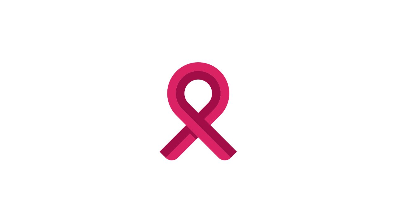
The National Breast Cancer Foundation emblem uses the same colors as the nameplate and is composed of a solid white rectangle with an elegant pink plant on it.
It is a symbol of energy and feminine nature, it is welcoming and friendly, evoking a warm and kind feeling, showing love and care.
The National Breast Cancer Foundation logo is bright and instantly recognizable, it is a sophistication representation of one of the problems women face today, but it gives a positive sense, telling that everything is possible.
Font and Color
The serious and stable three-leveled lettering from the official logion’s the National Breast Cancer Foundation is set in a strict and bold sans-serif typeface with distinctive contours of a heavy title case characters. The closest fonts to the one, used in this insignia, are, probably, Genera Bold, Segment Black, or Candid Extra Bold.
As for the color palette of the National Breast Cancer Foundation, apart from iconic pink, which here is used in two shades, it also features a deep and calm shade of blue, a color of confidence, trustworthiness and reliability.


