

![]() Parental Advisory Logo PNG
Parental Advisory Logo PNG
The official Parental Advisory logo hasn’t changed that much since its introduction in the late 1980s, while the earlier warning labels had a completely different design.
Meaning and history
![]()
The Parents Music Resource Center was created in spring of 1985. Its founders were several influential Washington women, including Mary Gore, who later became the Second Lady of the United States. The PAL logo was adopted by the Recording Industry Association of America in 1985 and is still not obligatory. In the UK, it was adopted in 2011.
1980s – 2001
![]()
Before the “Parental Advisory Label Program” actually started working, there existed other versions of warning labels. For instance, some music albums were released with a grey circular logotype containing the following text: “Warning. Tone of this record unsuitable for minors.” This label was widely used during the 1980s.
1990 – 2001
![]()
In 1990, the warning labels went through a complete overhaul. From now on, they have always featured the words “Parental Advisory.” However, there was a difference between the older and the current versions.
The 1990 label read: “Parental Advisory: Explicit Lyrics.” The text was given in three lines. The first and the last lines were black with white letters, while the second line contained black lettering on the white background. The lettering could be given in varying typefaces. Typically, the label was supposed to be placed on the lower right corner of the album cover.
1996 – Today
![]()
In 1994, the label was updated. The word “Lyrics” was replaced by “Content.” The overall design of the logotype remained unchanged. It can go either with a bold black frame or without one. Although there are standards for the Parental Advisory emblem, they do not forbid subtle variations as to the shape of the design elements and their placing, so one can encounter quite a few versions of the emblem.
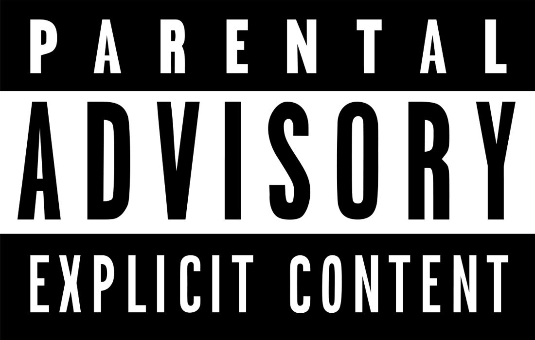
Interestingly enough, the labels are called stickers, as originally they were stuck outside of the cases. Today, though, they are printed as part of both physical and digital artwork for albums.

1996 – Today
![]()
The redesign of 1996 has slightly refined the lines of the lettering on the Parental Advisory logo, keeping the overall mood and style untouched. The contours of the uppercase characters became a bit cleaner, with the letters looking more modern and stable. The typeface was switched to a more geometric one, but stayed in the same style group as the one on the previous version.
Font
![]()
The Parental Advisory logo versions vary a lot in terms of typeface. Typically, it is a clear, perfectly legible font without any unusual details.
Color
![]()
Since 1990, the PAL logo has been featuring only two colors: black and white. Some of the earlier warning labels also used other colors (for instance, grey).


